The Circle Can’t Be Trusted: Drawing Battlestations
Or: Round stations & the pitfalls of trilateral symmetry, a followup to Zen and the Art of Battlestation Construction
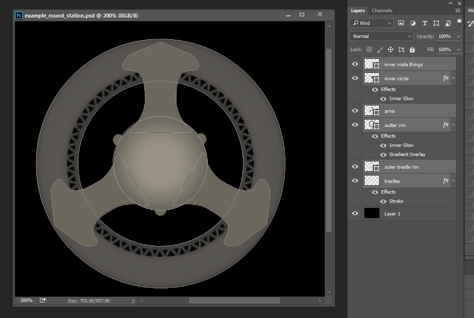
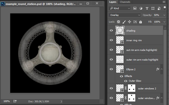
Herein we shall examine in detail the process of creating the Battlestation sprites. There’s gonna be a lot of Photoshop talk, so be warned. Here’s a taste of what a mess my station file is, perhaps revealing a little too much about how I actually work:
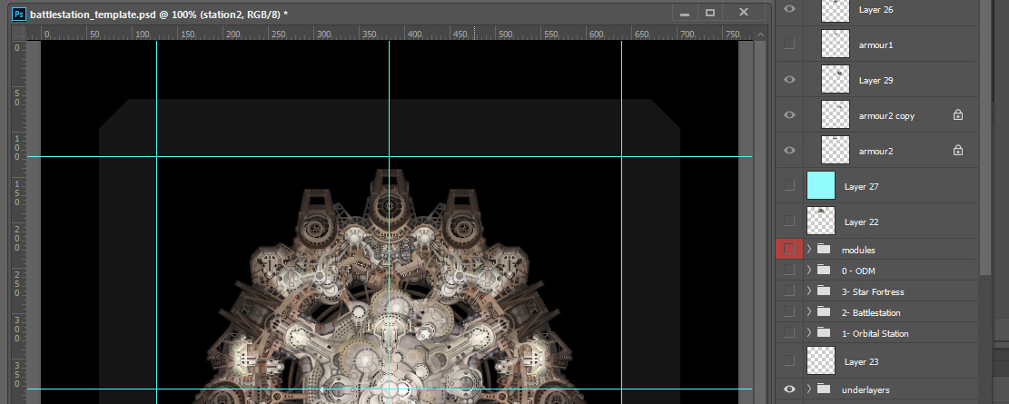
Very poor layer naming discipline and related sins on display, for sure. But that aside, let’s start much simpler with a little talk about something we call composition. I’m going to take a classic ship and break down how composition is operating on various scales. Then, using the methodology explored in that process, we can examine how I built the composition of an orbital station sprite. Then I’ll talk about a bunch of random non-pixel art techniques which may be found useful for drawing large station sprites.
What is a sprite? A miserable little pile of pixels.
In terms of Starsector in particular, though this can be applied in general practice, one can approach composition by considering how the image is working on different scales, or sizes, or resolutions, or whatever you want to call it. (There’s got to be a better word for this, but art school was 10 years ago and they never discussed sprites. If you need help with a performance installation however, I’m your man.)
The way I think of it is essentially 1. what is the shape of the entire image? You can see this if you squint real hard at the image and see the major blocks of visual area and how they relate. We’re talking just a handful of major shapes in play here, maybe. 2. Step it up a grain – still be squinting, but do it a little less hard – and see how the image works on a medium level. We’re not quite at the fine details, but how do the parts of those shapes you identified in the first step define their form and use their own forms, values, and positioning to relate to the other shapes in the overall composition while retaining some identity as their own? 3. Now get your face real close and look at the grain and detail and texture of the image without the big picture. (This was always my favourite part, and it’s real easy to get lost obsessing with detail.)
Consider how the small details add up to form the components of larger shapes, and how that process is done at larger and larger scales until you return to the entire image.
Now let’s look at some visual reference to illustrate what I’m talking about here.
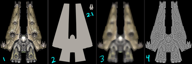
- This is the Falcon with which you are familiar. A handsome ship, yes?
- The large-scale composition, essentially its silhouette against a dark background which approximates how you’ll usually see it in the context it is presented in-game. You can see the major shapes & how they relate.
- (Also note how the silhouette works at a very small scale. This is important because if your composition works at a tiny size, then you know it works. Ahem, and I’ll be the first to admit that not all of the sprites in Starsector are so clearly identifiable on this level.)
- Here I’ve removed fine detail. All we see are masses of colour, of light and shadow that define the form of the sprite. In terms of ship sprites, you should be able to tell what the shape and topography of the sprite is even if it’s this blurry– if you can’t, then I’d say there’s a problem with mid-level composition (and it’s likely because there’s a focus on finer-grain detail at the expense of mid-level features).
- And this last image shows the lowest-level details without the mid-level elements. This is what the sprite might look like if you rendered the sprite zoomed in to like a 10×10 pixel screen and didn’t consider how colour and shading related across the mid-scale composition.
The biggest pitfall I see in amateur pixel art is obsessive focus on the details, #4 in the image above, at the expense of mid-level readability which is really what binds the image together. I’d say this is certainly true of my earlier works and ties in with what I was getting at in my post on The Trouble With Greebles.
If you mess up the silhouette, #2, it’s pretty easy to tell because all you have to do is back off (or scale to a tiny size) to get some perspective.
A Fascinating Aside: Game Assets and Composition
Game assets are not, in fact, final and entire works of art. They’re pieces of the final form which are assembled in the game itself. So they don’t actually have to completely work as a composition unto themselves so long as they work correctly within their final presentation. A reductive example of this is an explosion glow effect sprite, which looks like this:
![]()
This obviously does not look like a complete work of art and doesn’t read as a compelling composition. Only when it’s seen in-game fulfilling its intended role can it be judged.
Another example can be found in textures for 3D games. So, because I love Quake so much, check this out:
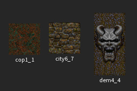
From the left, the first texture is just detail and noise, almost no composition at all (Although! Making textures so they have *no* discernible composition requires some hard work and conscious effort, otherwise you get weird tiling artifacts that ruin the illusion of seamless and infinitely repeating texture). The second has mid-level detail, but as with the leftmost example, the highest-level composition is deliberately nullified so the texture can be tiled.
The third texture is just a badass demon face that looks cool.
In conclusion, composition should be appropriate for what role the image serves in the real composition: the game. When I was art directing, when my art team was making trees I’d tell them “remember you’re making a forest, not trees”. This wasn’t at all confusing, I’m sure, and definitely did not contribute to the trope of art directors saying crazy things.
Back At The Space Ranch
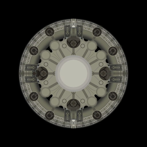
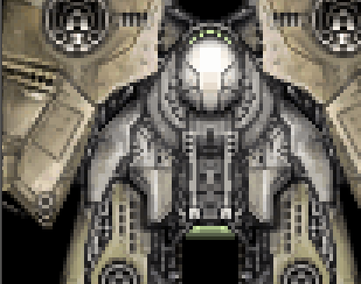
If memory serves, we were going to draw a space station for Starsector, right? And we know what Starsector stations look like, more or less. Something like this:
(The background for all of this and related thought-processes are covered in detail in Drawing Redacted Battlestations part 1. You can review that post for why stations must be top-down, and enjoy my various abortive efforts at drawing the ISS Placeholder. There’s also some good stuff in Alex’s post Orbital Stations in Combat where he talks about developing the mechanical framework for stations, which provides the design basis for everything I’m working on here.)
All caught up? Great.
I was going to say Let’s build one up based on what we know about composition:
- Overall/composition,
- Mid-level composition,
- Details”
… but that’s not how I actually drew these stations.
Partly – and let’s clear the air upfront here – I was being irresponsible and getting excited about details. Partly I was trying to feel out an aesthetic for the station overall, and this necessarily involves filling in some details, albeit ideally as economically as possible via re-use and kit-bashing. And partly we were, while all of this was going on, iterating on the design of the station itself (as covered in the previous blog post) — this process isn’t nearly as clean as I described, there were many more ideas sounded out, false leads, and loose ends which are still, even, being wrapped up.
Such is the process of creative development! It’s always a bit of a mess. Still, I do always return to considering how the sprite looks at those three(ish) levels of composition. It’s a process of getting lost in part of the drawing for a while, then zooming out and asking myself if this is looking like I want it to look.
(Sometimes I zoom in and ask the same question, though I’d argue that the details are far less important. One major reason for this is that in-game aka the final and most important place this will ever be seen you’re going to be real busy dodging lasers, missiles, and incoming shells with little time to spot an awkward pixel or two.)
Back to the story: Looking back through my extremely messy Photoshop file, I can roughly reconstruct how I built up the station sprite.
Start with the ring shape, give it some trusses, lots of circles, fill in the middle, and we’ll need lots of mounting points to stick modules or whatever on here.

I decided I didn’t like what I did in the middle at all, and it didn’t evoke the station icon very well, so I chopped a big circle out. From there, it needs some arms, some greebly kit-bash (I believe from the Derelict Mothership – it’s a great source for large areas of texture and greeble.) Refined the outer edge a bit, made it much darker especially because when you stick modules on the edge you want to give the impression that the modules are “above” the station ring, not on the same level.
And then we decided that four-way symmetry is boring, so tri-lateral should be the way to go.
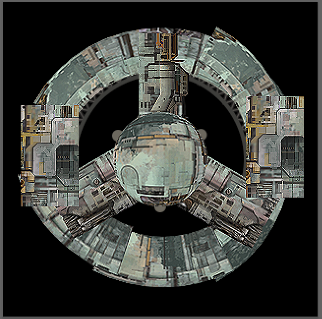
Trilateral symmetry is a pain because you can’t rotate a raster image 120 degrees and not get lots of gross pixel-artifacts. Let me zoom in and show you horrors:
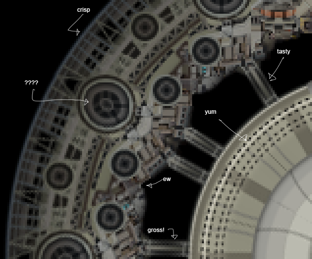
What are my options here? Redraw the entire thing from scratch? There’s no way of getting positioning of everything correct on a station made of cascading circles doing freehand pixel/painting without driving myself insane.
One could do as much work as possible using vector drawing, which provides a clean rotation. If I was faster and more comfortable with vector work, I’d consider doing that for a single 120 degree segment, then copy & rotating that twice. I’m not really a vector guy so it wasn’t appealing (though I’ll use it from time to time – and I’m starting to use it more and more because it really IS efficient for doing stuff like this. More on that later.)
I eventually decided that we can make this work – even if I can’t draw one segment and rotate it to get the others for free, I can use what I’ve got here as a base and do (lots) of touch-ups on the messy part then mirror it for the other half. Instead of drawing one and getting two for free, I’d draw two and get one for free. That ain’t bad.
It’s not going to look perfectly symmetrical, of course. And this can in fact be a strength, because perfect symmetry is boring! Starsector is a messy world, everything is a bit beat-up and modified. A janky solution for a janky aesthetic!
Let’s take the station up to about where it’s at now.
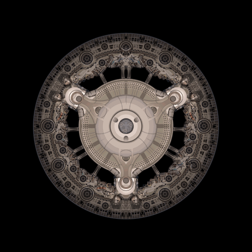
You can see how I rotated one section, touched it up, then mirrored it to complete the circle. We also decided to embrace the idea of assigning a tech level, so this is done up in low-tech colours. Module attachment points were adjusted and iterated alongside adjusting and iterating the mechanics-side design of the station; you can see mounting points for bastions appear once we stumbled into that idea. Then the top module attachment points are pushed out to fit the extra-large extra-tough combat module which is placed on that side of the station. The other two sections mount somewhat smaller modules with hangars.
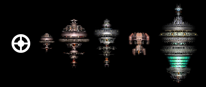
This is, by the way, the smallest size station – level 1 of the 3 possible.
How to drawn an owl
I must apologize for being a bit hand-wavey about technique up ’til this point; it’s mostly been theory and composition and nothing about how I actually drew any of this. So here I’ll go over a few methods I used!
Trestle-looking Parts
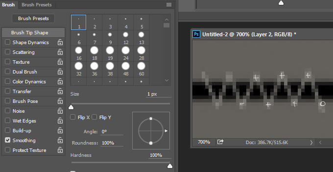
The key thing here is that holding down shift while you click while using the brush tool in Photoshop will draw a straight line. (Holding down shift while drawing a line is also interesting, as it’ll lock it to a 90 degree angle.)
Want lots of nice trestles? Just select an appropriate small brush and start clicking along alternating sides. You don’t have to be really precise about it, no one will notice unless you really mess up, and then a fix is just a ctrl-Z away — Or remember: this is Starsector! Things are a bit janky, just integrate screw-ups into the design.
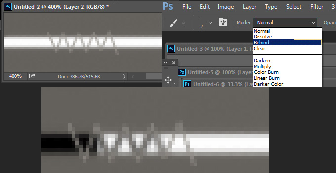
Be sure to view any alpha-backed trestly bits on a light background as well as dark. While it’s true that you’ll most often see these sprites on the blackness of space, you never know when a bright star or nebula will pass behind your sprite, or perhaps when your sprite will overlap something else, so it’s important to go in and give the trestles some depth. Here I chose a slightly larger brush with a much darker colour and set the draw mode to “behind”, then did another pass over my lines.
A layer effect like outer glow or drop shadow can work as well.
Drawing these on a curve is really easy, too! There’s no need to stress out about getting it perfect.
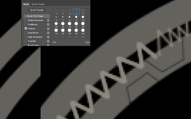
Those armour plate-looking shapes are also done with the shift-click method using a brush with a dark colour and middling opacity. Remember to do lines lighter than the surrounding pixels as well, if all linework is dark then you’re still thinking like you’re doing an ink drawing with ballpoint pen – the computer gives you lots of power to break out of those trappings, so use it!
Rows of tiny windows
Just go in with a 1 or 2 px pencil brush and go to town, right? Sure, maybe. (Then I get obsessed with detail, emphasizing windows with lighter surroundings, making others look a bit inset by darkening the material around them…)
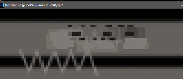
But try drawing rows of tiny windows on a curved surface? Good luck with that. You could free-hand with a 1px brush, maybe, but it’s going to be rough getting a perfect circle of beautifully flowing lines of windows
So here I just suck it up and use the pen tool to do some vector drawing to which I apply a dashed or dotted line.
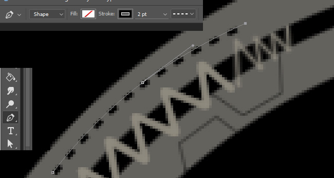
Set that to 80 or 90 percent transparency, and you’re good. Want to make these look like inset slots? Copy the layer, offset it by a couple pixels and set the opacity much lower. Want to make it stand out even better? Make another copy of the dashed window line, turn it into a solid line, give it a light colour and higher opacity.
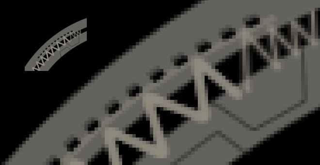
Hey, cool! Give that curved section some better shading and we’re well on our way to some kind of space station.
More Struts
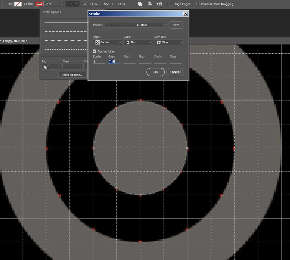
What if we’re really obsessive and want perfectly spaced trestles on a curve? Just use the window trick as a guide. The stroke settings on the line tool are extremely powerful (you can even do micro-adjustments to values using the mousewheel.)
With my guide set up, it’s just connect-the-dots however I like.
Pipes/wires
A souped-up Falcon mk.2 sounds like just the thing we need, Ill-advised Modifications be damned!
- You can do these as vector lines or as freehand brush strokes. Just choose a lighter colour and draw some wiggly bits. It doesn’t look great at first, but it’s the shading that will sell it.
- Rasterize this to a layer, and lock it. Go in with an airbrush and add shading – just drawing on the pipes ’cause we’re locked. You can use various sizes of airbrush to integrate the pipes into the topography of the rest of the structure.
- Then you need a shadow layer. Much like the struts, these need a bit of shadow under them to sell their volume. You can either airbrush this in, or you can maybe make a copy of the pipe layer, lock and fill with a dark colour, unlock and blur a couple times, then put that under the pipe layer, maybe offset with respect to the ‘front’ of the sprite, whatever looks right. You could also do an ‘outer glow’ or ‘drop shadow’ layer effect, but I think some manual cleanup is required if you go that route.
- Speaking of, cleanup is last. Using a soft eraser, cut off any hard ends of pipes and soften anything that’s making itself stand out too strongly. Can go in with some dodge/burn as well to get some better saturation and hue variance and make the shadows/brights pop.
Bringing it together
Well, let’s bring it all (or most if this) together shall we? Here I’ve build a round station out of shapes and lines and trestles. A few layer effects are applied to provide a start on shading. I’ve even named (most) layers!
It’s a decent shape which fulfills stage 1 of building a composition, and it’s in a state where I could start working on aligning modules, but we’re going to want to put some texture on there.
What’s neat here is this doesn’t have to be a lot of work! I just pull up my handy Derelict Mothership sprite, crop some blocks from flat planes, warp them around a little without much care at all for getting angles exactly matching, run some sharpen filters (you’ll see why in a sec) and get something like this:
Hideous, you say? Ah, but we just need to make it more subtle. I copy every other layer of the station, flatten, and fill with solid white to make a mask, then apply that mask to the texture layer. Then I set the texture layer to 20% opacity on “overlay” mode.

This is a good start from which I can build up the real detail layer, more mid and low-level definition, and so on.
I’ll put a bit more work into this before getting to my final point.
So there’s more mid and low-level detail, almost all just simple shapes pushing lights and darks up and down.
Going back to the composition of the Falcon example, what we’ve got here has some nice detail, a very distinctive silhouette, but I feel it lacks a connection between the highest level detail and the mid-level detail. Even though there’s contrast in the details, every part of the sprite looks like it’s on more-or-less the same “height” — if you take a crop of any small area, from the central hub, the arms, or the outer rim, you’re going to see the same range in value (aka lightness, or luminosity) from darkest to lightest pixel. Even if this is competently executed, it’s boring! (Doesn’t help that it’s a rather flat greenish-grey either, I suppose.)
Let’s make some decisions about what’s what: the rim is lowest because it’ll have modules attached to the “top” and it won’t receive weapon collisions in combat. It’s got to very clearly read as not in the field of battle. How to do this? Make it way darker. The hub at the center will be the “tallest” part of the sprite; it’s the most important, the command and power nexus, so it gets to stand out by being brighter. The arms come out from there, and these will be able to be hit by weapons fire, so they’ll still be fairly light compared to the outer rim, but not so light as the hub.
I’m going to do this the easy way and just make a selection from the kitbash texture mask (hotkey “Q” to convert your selection back and forth from a paintable field), then pull up an airbrush with colours set to a very dark blue for darks and white for lights and then I’ll go in and eyeball the shading.
Better! If I was doing this for real I’d go in and define the transition from arm-to-rim node really clearly so that the arms read as shootable parts and the rim reads as beneath the battlefield.
Anyway, let’s do an adjustment curves to really define the lights and darks. Could do some colour filter here, or maybe a gradient overlay to shift colours around a little; all of this can serve to get the different pieces of the sprite into a similar-looking colour-space. So while everything can have a distinct colour, if the shadows are a bit bluish in one place, then all the shadows should be a bit bluish whether the structure is blue or not. If all highlights are a warm yellow, same deal. All parts of the sprite should look like they exist in a consistent world.
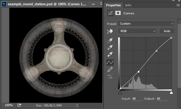
Ah, now that pops! Clearly needs some work – the arm-to-rim nodes especially, but also some detail in the central hub. Now that it’s so bright, it washes out the texture a bit and calls lots of attention to its washed-out self.
I’ll note here that I’ve done zero pixel-art and no small-scale painting on this image so far, and if I were to call it done, it’d require an hour or two of that to make it really snap together. And after that, more shading adjustment, to say nothing of looking at what it looks like in-game with modules attached then iterating based on that presentation.
Going so vector-heavy is not my usual approach, but the idea here is to emphasize some quick and easy non-pixelly methods you can use to get an interesting start on a sprite with complex curved shapes while using the concept of the levels of composition working together as a (rough) guide.
Here’s the PSD file for this mini-station if you’d like to see it for yourself. Feel free to do anything with it.
Anything else? No? Great! (But I’m sure I’ll write more on spriting technique in the future — I also did a rambling, poorly produced video in which I showed off drawing some non-Starsector ship sprites which might be of interest to people who really badly want to know more about how I work.)
Hope you had fun, these battlestations are going to literally blow you away!
Comment thread here.
Tags: battlestations, gif madness sweeps through the Starsector dev team leaving not a soul untouched, photoshop, station