Zen and the Art of Battlestation Construction
Tactical combat involving battlestations is a logical extension of the REDACTED BY HEGEMONY COMSEC most players are already well aware of despite dire warnings to avoid them from our benevolent protectors. Stations are also part of the colony-building features Alex has discussed recently, though I can’t make comment on how precisely they will play into the higher-level simulation.
However it’s going to work, we’re definitely going to need some enormous space-fortresses bristling with guns and danger. Someone is going to have to draw these things and figure out how all the pieces go together!
So let’s talk about how we developed a design for these things!
Restate the assumptions
The first step is to consider how stations are meant to fit with the rest of the game, even if details about the campaign level aren’t known yet. Due to certain REDACTED elements unleashed in the last major update, we actually do have some good experience with how stations play in tactical battles, so that’s a great starting point of practical knowledge there. Let’s restate some design imperatives:
- Stations should be more powerful than the most powerful battleship.
- Stations should be awe-inspiring.
- These are the space-castles of the new dark age, and they should look like it!
In game-engine terms, a station (as discussed in LINK REDACTED BY HEGEMONY COMSEC) is implemented as an immobile, rotating base “ship” with smaller ships (as “modules”) attached at various points. These modules have their own sprites and act as sub-ships with motion determined by their parent’s rotation. Stations also get a unique hull system which provides all of their weapons with a huge range boost so you can’t sit at max range and plink the station to death.
Back to modules: How big should these modules be? With the REDACTED battlestation we could get a little silly with the design and not worry about game balance too much provided everything looked cool and was both challenging and interesting to defeat. Here I imagine we’ve got to be a little more careful because it’s likely that more mundane stations will be a more common opponent so they need to fit more closely with the game’s power curve and world-building.
Battlestations, take 1
When presented with a complex problem of seeming immense scope, one may simply jump into a solution with the understanding that the first take will be insufficient, but that the experience of working out the issues therein may inform a much better subsequent solution. So this is exactly what I did!
Here’s the first-attempt plan:
- The station will be a big round wheel-looking thing, like the small station sprites in the campaign suggest.
- The rim of the wheel will have lots of heavily armed modules.
- Let’s use four-way symmetry, because it’s easy to losslessly rotate stuff 90 degrees (so I don’t have to draw so much unique junk at strange angles). (And a warning from my future self: Down this road will lie no small amount of pain!)
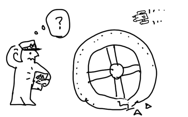
Cool, let’s do it. I drew a big circle-looking sprite plus some modules to stick to it.
Here’s what the very first take looked like:
Yeah, that’s way too small, the firepower is insignificant. It was underwhelming and boring to fight.
(Though, aside, I did play around with the idea of small defense platforms like the above, but smaller. We might revisit this idea.)
Graphics here are quite placeholders, of course, but not completely awful ones. I do want to test how the masses and composition feel to be able to understand their visual impact before spending far too much time polishing art that I absolutely know is going to have to change. There’s lots of use of kitbashing here, plus simple fills, linework, and gradient shading.
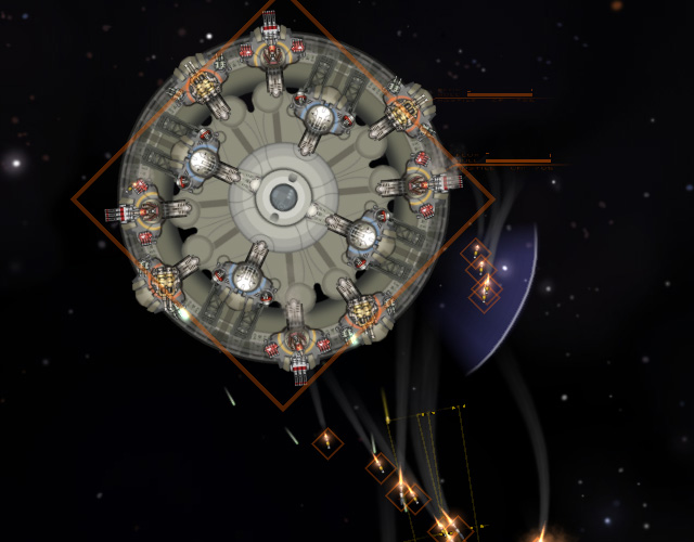
Okay, too small? Let’s make it bigger and pump up the guns.
Here the sprite has become rather larger and the layout is looking a lot like the circle/plus of the station icon from the campaign map. You can see how the shield modules are done in a white higher-tech style so they stand out as clear targets. My thought here is the classic scifi media trope where you have to take the shield generator out before doing whatever else needs doing to blow up the station.
It’s still too small, though, and doesn’t have the firepower needed to stop a proper fleet. One Onslaught (D) can make short work of this station.
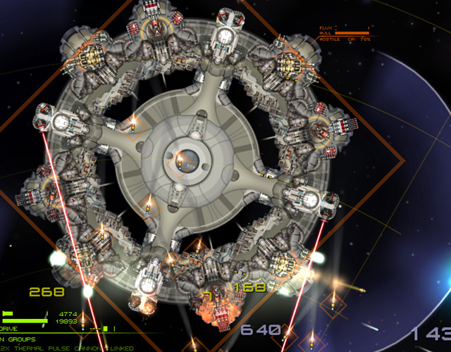
As for what’s working, the concept of distinguishing modules by weapon slot type seemed cool, so I went further with that:
More guns! Also module loadout types are distinguished by colour using the UI hint colour per weapon type as a starting point.
You may see that there’s also a layer of decor modules underneath the station base sprite. These would have no hit box and be treated as pure decoration. We ultimately removed these because it made it a lot more difficult to see what was going on, though they did look pretty cool. The thought was that these stations are of a spindle-type, like so:
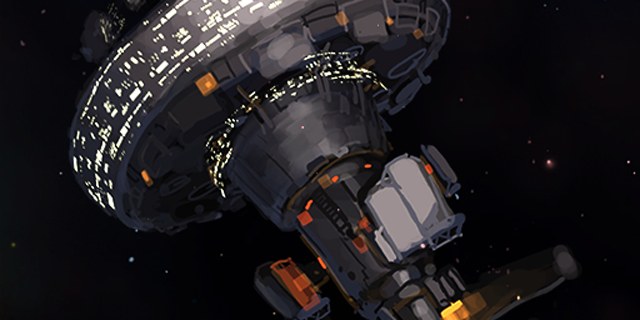
(This painting was used to make the colony-screen icon for the orbital station.)
And we’d portray this spindle from the top-down, which is where you get the round shape with modules stuck on. Or something like that.
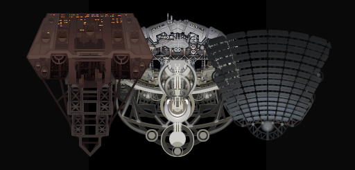
I rather liked how the these looked, so I’ll just take this moment to show off a few unfinished sprites I cooked up for station decor.
(It is important, in game development, to know when you ought to throw an idea out. If an element exists solely because you think it’s cool for its own sake rather than for the sake of the game’s design goals, then one risks weighing down development with unneeded and even irrelevant complexity. This is not to say one should never indulge, of course! The trick is to indulge only when you’re really willing to pay for it.)
Next iteration!

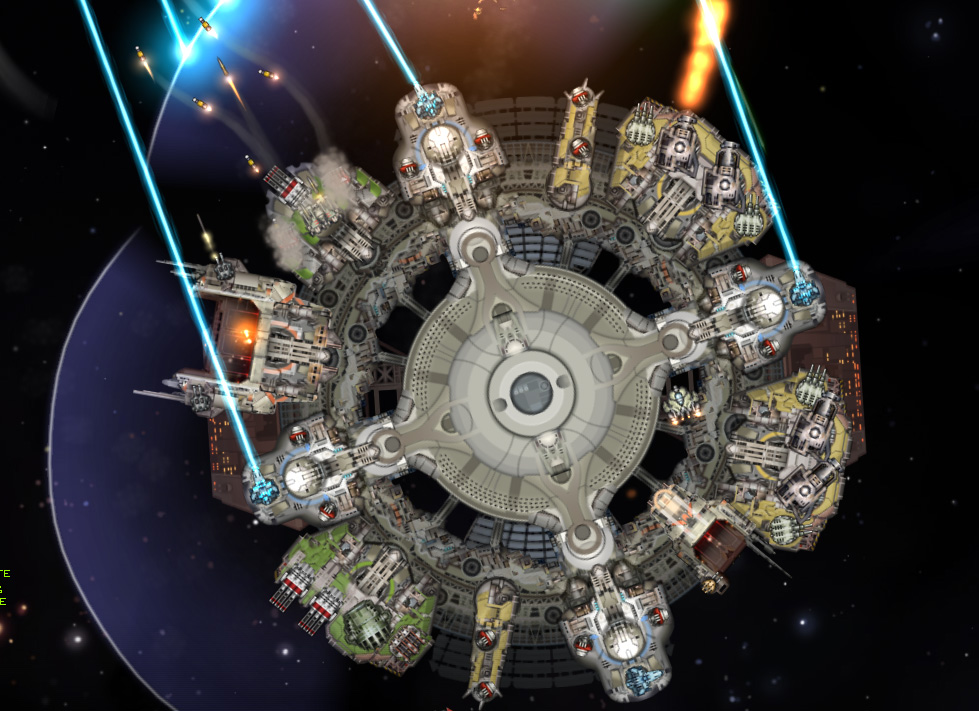
About here is when I thought we might be almost to a state that’s more finalized. A few interesting developments are coming together here:
- Armour chunks in front of important modules to make them tougher and give rewarding visual feedback as you wear down their defenses (though we did this with REDACTED so it’s not exactly a new idea).
- Shield module strength is discernible by the size of the module, and they’re NOT evenly distributed. Bigger = stronger, naturally. The side with the weakest shield also has the biggest guns, so there’s that to worry about.
- You can see some ‘spurs’ of armour modules set between weapon modules; this is to reduce exploding chain reactions when a module is taken out. Yes, that sounds cool, but it makes stations way easier to beat than they ought to be.
Though all of this looked pretty good, it was not creating very interesting fights. Tactics were essentially 1. find weakest side of the station (generally that which can shoot you the least so you can grind the shield), 2. pour fire into that, then 3. roll up the flanks from there. There wasn’t much consideration of individual modules aside from paying attention to the flux level on the shield module for the quadrant you’re cracking first and then everything else, which could mostly be ignored. In terms of UI, it was extremely difficult to even place the targeting cursor over a module to set it as target to see what its flux/health levels are, and there were just so many modules all over that you may as well not bother. Just pump fire into the mass of the station and hope for the best.
We discussed at length all sorts of factors, including how the arrangement of modules on the station itself creates a sort of “tactical topography”. If there’s a simple ring of modules spaced relatively equally with relatively samey shield coverage, then it seems like there’s an axis of positioning – distance from station center – which isn’t being utilized. The battle is always just break the ring at the correct spot, then roll up the sides.
What if we arranged modules at varied distances from the station center?
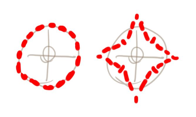
Theoretically the star pattern would provide a more interesting tactical space than the ring pattern, everything else being equal. Of course everything isn’t equal, which can make it more interesting. So where do the shields go on this – the points? The concave sides? (The REDACTED battlestation uses this module pattern, of course! And I will absolutely recognize here the irony of painstakingly discovering why the REDACTED battlestation layout works. It’s funny, because when I made that one the first time it was almost entirely driven by the desire to make something that looked cool. Turns out there are some good reasons why it plays better than the alternative!)
More ideas: What happens if there are outrigger “bastions” projecting outward from the station? Looking back, Alex used the phrase “motte and bailey” in this discussion, and it’s kinda fascinating to find some parallels between the development of our discussion on what to do with stations and historical fortress design – just look at “star forts”! (Hah, and that works on like two levels for us here. And yes, I’ve gone down this line of thought before.)
This whole design needs 1. clarity and 2. to present actual tactical decisions. When attacking an opposing station, like when you dance with an opposing capital ship, you should know where each side stands at all times and consider your moves in relation to those of the opponent. The range of possibilities there should not be just one correct answer because, to quote one of my favourite bits of design commentary: “If there is only one best move, then it isn’t a game – it’s a puzzle. Figure out the puzzle and you’re done.”
Battlestations, take 2
We talked about it a bunch. Thoughts that arose:
- If you have so many modules that targeting a particular one doesn’t matter, then you might as well not have so many modules. Bigger and fewer is better.
- Which part of a station to attack must be a tactical decision with meaning.
- There should be more than one way to kill a station.
These all somewhat related points, of course. How’s this work out in practice? Alex suggested making just three modules for the lowest level orbital station – and, if I recall correctly, this was after I observed that it seems like a station with trilateral symmetry feels way better to fight than one divided into four quadrants; three the lowest number of sides that’s still interesting, right? Clarity and interest.
This trilateral symmetry need not be entirely symmetrical of course, so long as the visual weight of each side looks semi-believable. So, for instance, one axis can have some kind of large bastion attached while the two others can have smaller bastions of a different type. Maybe the small ones are more PD focused, the large one mounting heavier guns, with a 2:1 arrangement of filler modules that have different shield strengths and loadouts.
Also, instead of a dozen or two dozen small modules, let’s use a handful of very large modules; one for each major sector of the station. This way a player can deal with one sector as a problem unto itself, kind of like if you welded three battleships together in a radial pattern.
Here’s a Photoshop mockup of what a level one station (no bastions) might look like:
The large station modules were made by jamming together a collection of the small modules I’d already drawn; just more kitbashing, no need to throw away all of the previous work.
And we keep the armour blast-blocker pieces between the three station sectors for reasons already established. The battlestation upgrade can turn these into extended spurs with bastions mounted on the ends, so instead of fighting 3 battleships welded together, you’re fighting 6 battleships welded together. Or maybe 4 battleships and 2 cruisers. (Work with me here, this is hardly an exact science.)
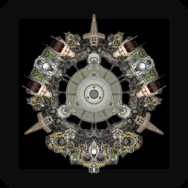
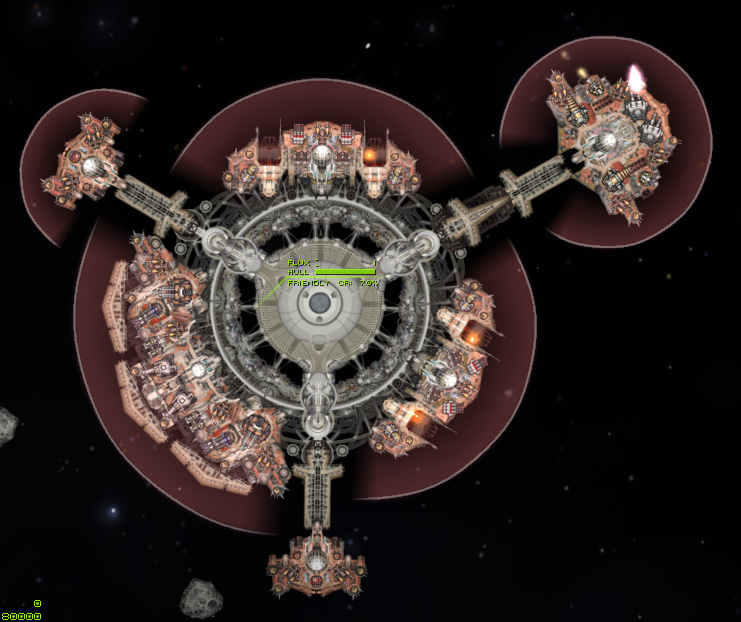
Here’s a take on the level 2 station – a battlestation – assembled in-engine:
For some reason this one got those decor underlayer modules back, which makes readability a bit of a mess. But! We can see that armour has been attached to one sector, and the blast blockers have grown into spars which mount bastions. The modules are absolutely too close together, it looks cramped in there.
We also decided that the bastion covering the two hangar modules was rather underpowered, and the bastions in general were too close to the primary ring. Further iteration:
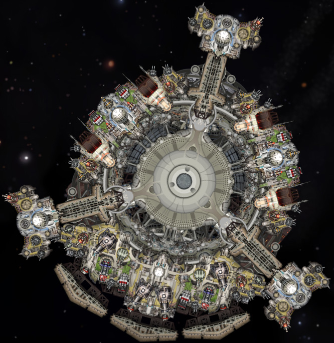
We’ve got a coat of low-tech paint so everything matches (I’m leaving tech level discussion aside for now!), better arrangement of modules, and tweaked loadouts. This is getting a lot more interesting to play in-game – smashing full-stats sim fleets against the battlestation is giving us a good run for our money. (Which I suppose is just 1 credit in the TriArcade, though if you want to purchase a TriLoot PowerCrate to TriPower-Up Your Game ™ using the balance in your TriGem wallet, just focus your eyes on the payment aperture’s retina-scanner… )
This isn’t the end of working on the station design, but we’re pretty happy with the principles established through this process, and now Alex is working on how these fit with the campaign layer. What exactly stations do in the campaign and how easy (or hard) they are to deal with will likely prompt further adjustment. Meanwhile I’ve got plenty more visual polish to apply, and additional sprites to draw.
Let’s split this post into two pieces; next time I will show in detail how I drew the station and module sprites, what challenges I faced, notably filling in giant sprites – always a pain – and having to rotate elements 120 degrees.
And now:
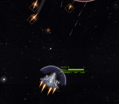
A Mint Condition Kite (Stock) Is Sacrificed To Flux Overload A Battlestation’s Point Defense Bastion
To be continued in Battlestations part 2: The Circle Can’t Be Trusted
Comment thread here.
Tags: a laborious recreation of MOO2 station battles in the Starsector engine, battlestations, design, game design, that's no moon