The Trouble With Greebles
I started working on Starsector in the middle of 2010, over five years ago. An artist grows and changes in that kind of time. It’s only natural that I’d refine my technique and artistic opinions regarding the art of Starsector. No, I’m not proposing the redraw everything! – just, perhaps, this and that which was inelegantly handled in light of my current experience. This applies to many aspects of Starsector, but in particular let’s talk about greebles.
The artistic (re)thinking the led to this post is entirely inspired by Niklas Jansson‘s writing On the topic of good spaceship design which I re-read every six months or so. I highly recommend reading it along with basically everything on his webpage, particularly his thoughts on making art generally and pixel art if you’re the artistic type. Let me pull a relevant quote from the spaceship design article from Jansson:
Sometimes when I do a design, I find myself filling the remaining last few areas/surfaces with irrelevant nonsense and greeble, and I may think that I can get away with it because I’m happy with the rest of the design. Unfortunately it brings down the overall quality of the design. What could have been contributing is not.
Guilty as charged.
Greebles are little doodads encrusted on spaceships without discernible purpose. At the best they are visual texture which contributes to a sense of scale, or – to borrow from Star Wars – to a sense of a “used universe”, to industrial-grunge aesthetics. I love all of those things. But at worst they are visual noise which muddles artistic intent, or even a crutch upon which to support a design which has a weak overall sense of form and composition. They can be a cheap path to adding visual interest with busy patterns and high contrast. Greebling can be a useful tool, but I’m much more wary now about it than I was five years ago.
I’ve always tended toward greebliness in my sci-fi art. Let me present an example from 2008: I was making a portfolio website totally covered in greebles to show off how cool and greebly I could be. Compare what’s going on here to Starsector ships you can doubtless see a continuity of style:
We’ve got everything: pipes, wires, that archetypical sci-fi shape- the rectangle-with-the-corners-cut-off, the fitted plating, the trusses. I’ve always found it really easy to get a groove going and just meditatively churn out interesting looking little bits and bobs. But standing back in time and experience, whatever was I thinking with the overall composition of that thing? That web layout is a nightmare of haphazard boxes that make not a damn bit of sense without the text in them. The most aesthetically pleasing bit is I think the transition from greeble-town to the rail-track things on the sides.
(And aside, I really did enjoy that background which was inspired by Jupiter’s banded clouds.)
So greebles are neat. Well my previously stated criticisms are clear: my concern is that I’ve used them as a crutch to create visual interest without content, and in ways that detract from overall design, detract from the composition. Worse still, I think there may be a lack of consideration for the context that these assets appear in – when I draw a Starsector ship, it is not a lone element viewed on its own, or alone on some off-black background. It is in fact an image moving through screen-space with the weapon graphics pasted on top, with damage decals, moving and firing at other ships and every second giving the player information about its status and its role both in terms of game mechanics and in the fictional world it inhabits.

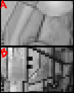
Which is more interesting to look at, A or B? Then: which is playing a supporting role better in the overall context of the work of art?
If I’ve learned anything about art direction in my past eight years of creating art for games, it’s that a single asset to a game is a tree to the forest; and what matters is the forest. A sole asset cannot be allowed to try to steal the show. The experience of playing the game is definitionally what the player gets from playing the game and the purpose of a game asset is to contribute to that overall experience, to play one part in a complex arrangement, not to be a thing which exists unto itself. Spaceship sprites are not paintings: it’s totally okay for something to look underwhelming if that is the correct role in the overall experience of the game!
So this is a matter of learning when to pull back, when to play a piece of art a little more softly and simply. Another quote from Jansson:
As a concept artist, I’m impressed when someone have managed to put several key elements into a design with as few superfluous “glue” pieces as possible. It’s like killing the desired birds in a flock with a single stone by carefully calculating ricochets. To me, someone can be great at painting, but still not a genius because they use too many stones and only hit some random and common birds anyways.
The Eagle
The Onslaught is probably the closest thing there is to the mascot-ship of Starsector. But its little cousin the Eagle might follow closely — the Eagle is a derivative of the Onslaught and absolutely an homage to the iconic Star Wars Star Destroyer.
With all the above in mine, my thinking on the greebliness of the Eagle’s armour has changed over the years. The impetus for this revision is, really, driven by a desire to create some ‘skin’ variants. And doing so was bloody impossible with all those greebles mucking things up! So:
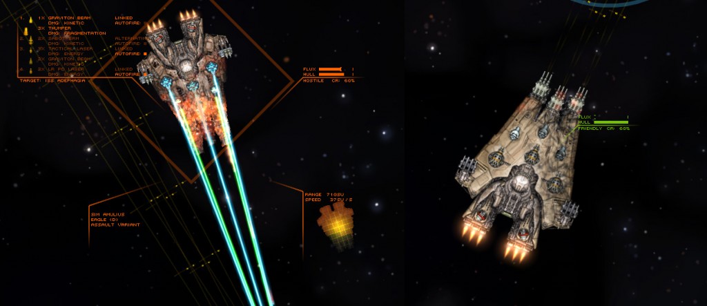
Certain core features remain, certain greebly areas are maintained. But I think the aesthetic context the Eagle fills is better served with a bit less noise over the bulk of the hull. There’s still texture, but now the turrets – of greatest concern to the player on the receiving and delivering end – are emphasized, and when the ship’s armour is damaged, the smooth moulded armour plating will be properly spoiled by noisy damage overlays. This serves to signal important information about gameplay more effectively! Plus, I’ve learned a thing or two in the last five years. My ships have become much more painterly and they use a lot more rounded elements and forms derived from vector shapes.

An Eagle-d on the left using the old greebles and a bit more grunge texture compared to a revised baseline Eagle on the right, sporting moderate damage.
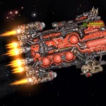
And here’s a little something new that hasn’t been shown off before versus a little something old:

Though as a metaphor of artistic renewal this image leaves much to be desired because my new frigate is going to be smashed by that old Gemini.
There’s a balance to be found on the line between texture and obfuscation, and there’s a challenge in overcoming use of obvious aesthetic shortcuts that signal visual interest but have no content. Every individual asset is a part of the overall experience and sometimes that involves holding something back in the individual components so that the whole may be more harmonious and meaningful.
Comment thread here.
Tags: art direction, graphics, greebles, greebling, pixel art, ships, spaceships, the eagle


