Salvors in the Ruin, a digital painting story
For the most part – for almost the entire part – I have been working on new game content since the last update. Talking about it in detail is 100% spoilers, and while I do believe there’s an interesting blog series to write about the overall strategy of narrative design in Starsector during a long development cycle, properly contextualizing it… well, that’d be spoilers.
What else to write about, then? Man, I dunno – but then I had a discussion with Alex about creating an illustration to go with the content I was working on and decided to show him all of my sketches leading up to the final composition. “This could be a blog post, couldn’t it,” I said.
So, hello. This is a digital painting blog post. I’ll show you my process and attempt to explain in hindsight why I made certain decisions. And, to come clean, this is only partially motivated by my desire to insert fan art for Alastair Reynold’s Revenger series into Starsector. (More of it, anyway.)
Earlier this week I created a mission which involves having the player fly out into the fringe of the Persean Sector to dig around in some ruins. There is indeed a Galatia Academy mission which does this very activity, but I assure you that this new mission does it slightly differently! And thinking about these two missions, I was struck by a notion: why not draw some Revenger fan art why not do an illustration of a salvage team finding loot in creepy ruins which could be used for both missions? This situation comes up fairly often in Starsector anyway, and I never really did previously create an appropriate illustration for this sort of thing. Great!
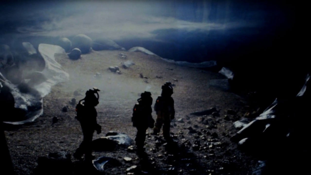
My mind immediately goes to the sequence in Alien where the crew of the Nostromo investigates a derelict ship on LV-426. That era of science fiction movie art production is a huge inspiration to my take on the Starsector aesthetic, as I’ve written about before somewhere on here at some point.
Here’s the shot:
Fantastic! Love the suit silhouettes, the texture, the grim lighting. It’s a bit too organic and boney for what I’m going for, but it feels like a good starting place in terms of setting the mood.
First take:
Yeah, okay. Vertical columns for a temple-like appearance but done in scifi-brutalism. Dark vertical shadows, silhouettes, bright spots of light. Cold environment vs. warm points where the “treasure” can probably be found. It’s not landing for me though; the image both doesn’t feel oppressive enough and doesn’t emphasize the characters enough.
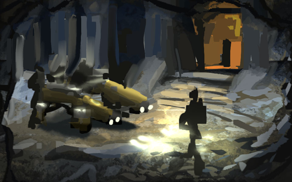
Second take:
No, not feeling it. Feels too much like medieval ruins with those stairs and the lack of verticality. There’s way too much focus on the little salvage vehicle thing – this image should not be about that, not at all. We’re going to have to do a radical revision.
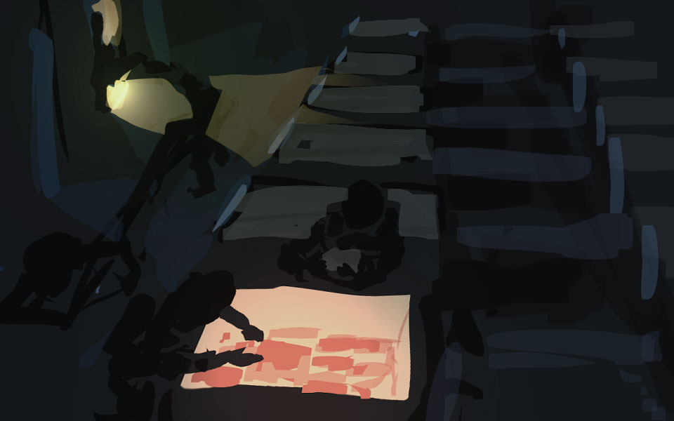
Third take:
I actually quite like this one. Alex commented that you should be able to see someone’s face, and I agree – probably the largest figure primarily, with dramatic underlighting. It’s a very “opening the treasure chest” scene with a warm focus and cool light coming from the environment and a spot from above.
However. This still doesn’t feel right. I might roll this off into its own illustration because I quite like it, but this wasn’t doesn’t feel like it’s hitting what I wanted to go for. It’s too focused on the characters, it doesn’t feel cold and oppressive enough, it doesn’t give you any sense of diving into and exploring huge, dead structures.
Fourth take:
Better.
Same basic setup, but pulled back from the characters. Rows of caskets of some kind are bathed in cool, dim light; “This place is a tomb.” Focus is off-center. We get a dynamic between the lighted hallway in the back – the way in, the way out – and our salvage team reaching into the “treasure chest”.
It’s almost there, but not quite. It doesn’t feel big enough. The space needs to open up – we need those vertical columns so that this tomb can feel more like a dead temple.
Squished the drawing down and added some background and, yes, that’s it! That’s our composition!
I noticed, also, that this happens to fit rather well into the rule of thirds. I wasn’t even thinking about it.
If it works, it works.
(You’ll notice that I did not do a line drawing at any point in this process. This is a painting, after all, and what’s important is to find out where masses of colour and tone go, how their shapes interact and fit into the whole. I figure you need to start the process by thinking about what the end should look like if you squint a bit.)
Anyway, now that I’ve got a composition in mind, let’s draw the rest of the owl.
I start by touching up the shapes of the figures so they’re not cosmic horror blobs, then adding a first pass of intermediate detail throughout. Added some figures in the back for scale [by the end, I do reduce their size a bit] to show that they’re bringing something in or taking something out; this creates a little narrative suggestion for how the foreground figures got there and where they’ll be going next.
(Of course, this could work just as well without the background figures and I’m tempted to cheese up a quick version that doesn’t include them. Check at the end of the post for that.)
The lighting starts getting a little attention so I know what colour various areas are supposed to be, and where to draw dramatic shadows.
Then, more focusing on the figures, their accoutrement, the little crates and cables they might bring along to do general salvage work. Laid out a few more points of light, particularly helmets and suit-mounted light sources.
Most of the detailing focus goes to the left side and foreground.
Stepping back, I realize I needed to add details to the right side and the background to bring it up to speed, so that came next. In particular I needed to figure out what these casket things looked like, how consistent they need to be with one another (not very; watch how those semi-circular pieces on the right side of the foreground casket flip), and how they fit into the scene.
The foreground figures are also getting more rendering from the lighting cast up from the casket.
The background figures get their darks lightening up so their whole zone of the image has a bit lower contrast. Maybe it suggests atmospheric shading; I’m not committing to whether there’s an atmosphere in here or not, but it pushes them into the background a bit more.
Much of the worldbuilding here is necessarily noncommittal – I don’t want the “caskets” to read clearly as anything in particular, I don’t want the place to be a building of identifiable purpose or even for it to be clear if this is a planet’s surface or a ship wreckage. (Microgravity? Don’t worry about it.) This has to work in almost any part of the game where the player is plundering goodies, so I’m leaving it all wide open.
I decided that the central figure looks too much like they’re holding a gun rather than holding a power tool, so that gets slightly redrawn. Perspective on one of the crates to the left gets altered a bit, though its buddy is still a bit off. I don’t think I’ll even fix it. [Edit: I fixed it in the end. It was bothering me.]
It is important to remember that image will be displayed in-game at half the size you’re viewing it at now ( – if you click on it to open it at full, working resolution; just as I paint the character portraits in 4x size, I now do these other illustrations in 2x size). The details can absolutely be murky and loosely defined, and in fact they may work better if they are. The number one rule is to set a mood!
I do a colour/curves correction pass over the whole image to get it feeling a little more unified, then do one more pass over a few key details that were bothering me – mostly to do with the central figure, who I suppose deserves some more attention due to drawing the eye. Some perspective lines have been cleaned up but I’m not being too obsessive about it getting everything strictly correct.
Now I just gotta shrink it down, run the trademark Starsector sharpen effect, add a dash or two of colour burn to calm down some of the lighter spots…
And we’re done!
Or not. Here’s a take without the background figures:
Aw, heck. I almost like it better because it feels more lonely and lets the scale reference in the background play a bit looser.
I’ll decide which one to actually use in-game, um, later. (Consensus is rapidly solidifying toward this version. Per Alex, “with the figures, it’s ‘bustling industry’, without it’s ‘horror-tinged tomb raiding’.” — And that’s me sold.)
Comment thread here.
Tags: Alastair Reynolds fan club meeting here at 8, digital painting, if they'd just followed correct quarantine procedures like Ripley wanted to they'd have been fine, illustration, sketching


