Painting the Stars
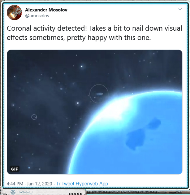
You may have seen this post by Alex come up on your TriPad™ last month – click to visit the lovely original video.
See also a related TriMedia Experience here.
Clearly, something’s up with at least one star or Domain-era tech definitely-safe star-like object. I’m not here to say what’s precisely what or how you players will inevitably try (and succeed) to exploit the mechanics of it, but more to speak about the artistic method to in portraying said star-adjacent objects and/or activities.
Well. I’ll have to spoil a little bit to explain how I’m approaching artistic these problems, so buckle up and be on alert for a COMSEC lockdown. This is the deep-dive digital painting post the Hegemony doesn’t want you to know about!
The Fusion Lamp
[Is/Are] your planetary [colonists/workforce/biomedium] looking a little gloomy? Do you feel like you’re in the dark compared to more popular worlds up-Gate? Fabrique Orbitale is here to show you the light, because “The Sun Never Sets”™ with the Fabrique Orbitale Orbital Fusion Lamp™.
 We wanted to explore the mechanical possibilities within the theme of lost Domain hypertech and megaprojects, so we came up with a list of problems the player may face in the embattled Persean Sector and then a list of hypertech and megaprojects that could provide Perfectly Safe and definitely Not Problem Creating solutions to these problems. One problem a player may find is that the star in a newly settled system is inadequate. This is where your Orbital Fusion Lamp comes in- it’s basically a big fusion generator facing your planet, providing life-giving light and heat well within the Domain radiological safety parameters (Frontier-rated only).
Let’s talk assets. This is an object the player may find and pick up during exploration, so it needs a cargo icon. It is an object in space the player may interact with, so it needs an interaction illustration. The cargo icon looks not unlike the image above and to the right, and I’m not going to talk about drawing it right now.
The illustration, the digital painting? That’s going to take some thought, which I’ll share with you.
Here’s a first take:
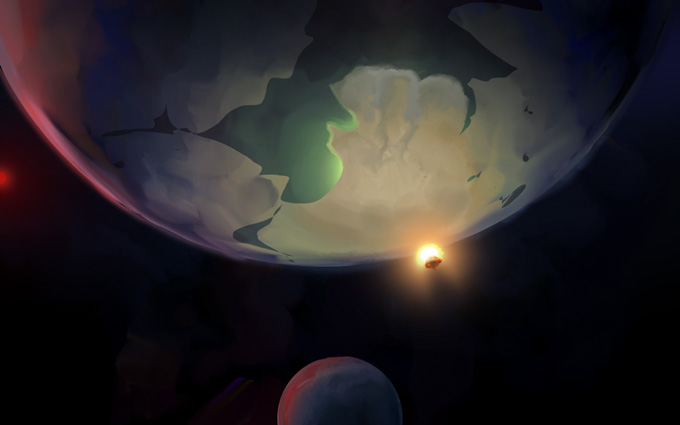
This has a lot going for it, and it tells a nice story. You’ve got a dim red dwarf star with some cold planets, particularly one perhaps tundra or terran-eccentric class world as the primary subject. Great candidate for a Fusion Lamp, let’s put one right there in a nice warm yellow to evoke the comfort of home. It illuminates only the one planet, not the moon (vs the star) to show its small scale. It’s drawn on top of the planet, over rather than behind the horizon, to reverse the expected sunset/sunrise order of silhouetting. You can see that this false-star is very much smaller than the planet. I love this ability in science fiction to take a small, normal thing and make it very wrong to demonstrate the scifi aspects of the setting.
Cool story, right? However it’s an extremely specific story, and by the time I got to this point I realized that I’m not drawing a Fusion Lamp for one particular planet, I’m drawing a fusion lamp for every planet. To be fair, these illustrations are about setting a mood rather than precise representation, so they can get away with suggesting particulars that don’t apply to the given situation. Still, there’s a balance to be met, and I think this tipped a bit far toward the particular.
New layer, let’s paint it again!
Let’s get closer, let’s focus on the fusion lamp itself:
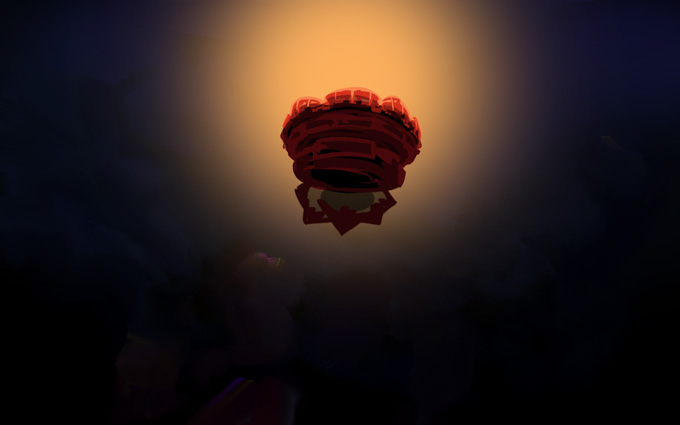
I do like how this evokes some kind of glowing deep-sea jellyfish; that’s just the sort of weird parallel that’s fun to stumble into. However it was at this point I realized that I was simply reproducing the cargo icon, just a bit larger and with different lighting. This is 1. kinda boring because it doesn’t even provide a literal different angle on the subject, and 2. tedious because I have to get this image to match the cargo icon exactly or else I’ll feel like I’m being sloppy. Nope, nope. Back up again.
The picture has to give the viewer something they haven’t already seen in the icon, and it’s got to be about a mood focused on the Fusion Lamp itself, not the setting around it.
Zoom in more! Get wild!
Here’s take #3:
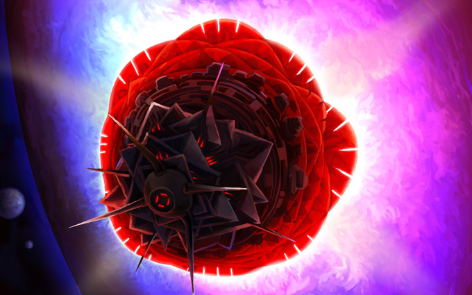
Yeah! Now I’m feeling it. And it feels hot. Like a burning bright rose blasting its light at a miserable ice-ball which is totally overwhelmed by the fiery fusion embrace of Domain-era hypertech!
The angle is slightly different, so it doesn’t have to match the cargo icon so exactly. Plus, maybe when this thing is deployed it alters its configuration a bit? Yeah, good. OK. And maybe I can still tweak the image a bit; whatever, this sells it, and it’s displayed in-game at 480×300 anyway so if the details don’t line up, no one notices until I point it out like I am now.
Moving along, the blue in the moons/other planets suggests coolness to contrast with the warm colour glowing out of the Fusion Lamp body itself, though its output is- well, it’s unclear exactly what colour its supposed to be because it’s kind of a weird gradient; very bright, maybe a little artificial. It’s not quite literal. It’s open to interpretation.
I feel like this is hitting the notes I’ve intended.
What was really a bit of a breakthrough for me came when I started painting the ‘flames’ coming out of the Lamp:
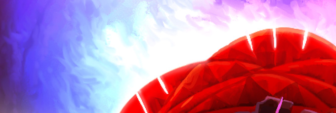
It gives a living, billowing, fire-like texture to what might, in a 3D render, be a flat gradient. I think this is rather key to giving the Lamp some personality. Which brings me to not just an important tangent, but the main subject I wanted to discuss!
Let’s talk about brushes.
Paint Brushes
I’ve recently taken up physical, real-life painting after leaving it behind for, oh, a dozen years or so. Art school burnout will do that to you.
Also: I can afford it now. Looking back, a dozen $30 tubes of paint is not something an art student can feel comfortable experimenting with unless money truly is no concern. It’s sobering to consider how conservative this made my artistic output, in retrospect. I only felt really free using ink, watercolour, and gauche because they’re cheap media. Digital painting has that advantage, too. Kind of. *side-eye at Adobe*
Here’s a look at my “studio”:
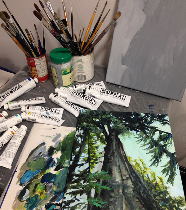
It’s strange to come back to physically painting from digital painting. No undo, no colour adjustments, fixed colour palette, no layers, no liquify tool – except, perhaps, with actual liquids. The parameters on all the brushes are fixed, and the damn stuff dries. It’s bizarre, how can anyone stand these limitations?
And yet.
You get, for free, a *ton* of texture. Drop almost anything onto that canvas, and so long as you commit to it, you can get texture that’s interesting to look at all on its own. Or just poke it with your finger, or with a stick, or drop some water on there and swirl it around; the methods of manipulating the form are multitude! There are no rules! And once you start embracing this rather than fighting it, well, you’re a painter now!
It turns out that knowledge and techniques I’ve developed digitally can be applied here, particularly that of composition and use of colour (though I’m still fighting with paint mixing; there’s a hidden parameter of pigment strength in additional to actual hue/shade/saturation and volume of paint that you simply have to get an intuitive feel for). Also, physically I can’t use the digital cheats that feel like I’m getting a nice effect quickly but are in fact crutches- smooth digital airbrushing, colour dodge, colour correction in post, gradients, sharpen (though in defense of these, I think they can be useful tools if used with consideration and restraint). I am forced to consider how to achieve the ends that are behind these special effects and then work for them directly and consciously; it makes me appreciate what they’re actually doing and when they should be used all the more.
All of this together makes me think about my digital technique from angles I hadn’t previously considered. Here’s the thing: I did not know how to paint digitally after graduating art school. It was something I had to learn using the “eye” I had developed in art school- but I had no technique. So I’m finding that adding the experience of painting with physical media, again, back on top of over a decade of digital art creation- wow, this is making new connections in my brain! It compels me to figure out how to produce the lively texture of physical painting in digital form. Heck, it really just plants seeds in my unconscious in developing both digital and physical painting, and makes me excited to try out new things.
(Another aside: Disco Elysium blew me away with its incorporation of painterly aesthetics into a video game more successfully than anyone has done before. Also everything else. But that’s for another post.)
Digital Brushes
Let’s bring this back into the digital realm. I get occasional requests to share my workflow and techniques. I must admit, it’s not something I’ve given a lot of thought into expressing in a way that’s useful for other people, more a giant mess in my brain that I root around in to get the job done in the least time possible. Still, I’ll give a shot at talking about the actual brushes I use most often in my work, though this is only a part of what makes up my whole process.
I paint in Photoshop. Mostly out of habit, inertia, call it what you will. I don’t love where Adobe is trying to take the product (into a rent-seeking, ubiquitously intrusive cloud product-family brought to you by a subsidiary of the Tri-Tachyon Corporation), and I loathe the experience of upgrading to new iterations of the software.
Still, it’s home.
I’m told Clip Studio Paint is a good alternative. I’ll have to learn it one of these days.
A few very simple brushes form the core of my toolset, probably due to habits I inherited by the ink drawing I did all through highschool and college.
David 4px round
This is the one. The one brush I use as a base for everything else I do. It’s the digital equivalent of this exact UniBall pen:
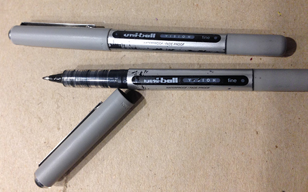
I’ve been writing and drawing with these for over 20 years. I always have a bunch of them. They’re right for me. Spiritually. (They also explode if you take them on airplanes, so don’t do that.)
My default brush is a 4px circle because that’s the smallest you can go and still have the ‘texture’ brush setting effect not make the line disappear. And you can get to almost one-pixel level detail. And because I’m an obsessive (albeit lazy) detailer, that’s what I want.
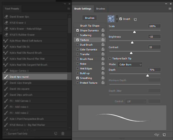
I use that ridiculous legacy bubble texture to essentially sharpen the edges of the brush and give it a bit of sharpness. It’s a truly dumb texture, but it works for what I need it to do.
This is the linework brush for sure, though I also use it to paint small details. I’ll even use it to blend because I’m crazy like that (though some of the brushes mentioned below are better for this sort of thing). When blending it pays to size the brush up a bit- 6px maybe, or more, depending on how much space there is to cover. The limitation here is that it doesn’t have a great deal of texture to it, and you’ll notice this especially when you start going to larger sizes. So we need more than just this one brush.
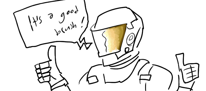
A note: Beware the tyranny of linework! If you think only in lines that get coloured in later as a separate platonic act, then you’ve limited your range. (Or you’re expressing a valid style; whatever. I’m speaking for myself here.)
The next four brushes are these:
- Kyle Belgian Comics
- David 12px triangle
- David 16x square
- David 24px airbrush
These are all very simple shapes, nothing all that special going on in the brush settings. The fun really comes in using them with a variable pressure pen with the Wacom tablet, and then in altering opacity.
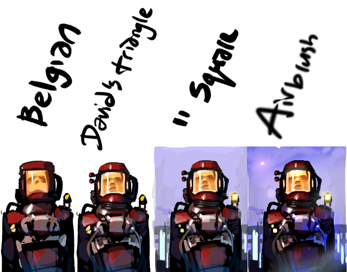
(Strong Lego spaceman energy here.)
The Kyle Belgian Comics brush is basically a 30px hard triangle brush- sure I’m jumping ahead a bit by talking about the Kyle set, but I’m counting it in with the simple brushes because it’s fundamentally simple. It’s *great* for laying down linework and brushwork that has some nice character to it. 30px is a bit too big for most of what I do, so I made my own version at 12px. But it’s the same idea.
The square brush is the same thing but a square. It doesn’t do much in this example image, but the square is especially useful to block out artificial environments or just do brushwork with a different character or texture vs. the triangle (though the triangle is perhaps better for natural forms).
A note on my use of the brush here: as I’ve discussed in a previous post here (a long time ago), I keep my left hand on the keyboard to control opacity, and will turn it up or down as needed while painting. I can also hit “alt” to switch to the eyedropper tool to pull a colour out of the image to paint with. Using these together, I can hand-blend using these sharp geometric brushes to produce a blend with a lot more character than a flat gradient, like so:

The (cursed) airbrush I use mostly for effects and adjustment, and this is probably definitely the cheesiest of the bunch because it creates a boring flat round gradient. Still, sometimes I just need to pop a bit of colour dodge on a point light – this comes up a lot in scifi scenes – or drop just a bit of shadow in that corner, or smooth out the skin on a portrait’s cheek, or add a touch of all-over atmospheric shading. I’ll use this brush at wildly different sizes, over huge areas, and especially in conjunction with a marquee or mask. If you’re dropping boring smooth circles everywhere (as I did above), you’re losing a lot of good opportunities for texture, and the perfect smoothness will draw attention to other visual noise and make it look like errors rather than texture.
If it sounds like this is a guilty admission to using this brush, that’s because that’s what this is. I still do it. But there are better ways to achieve most of the same effects. Let’s talk about them!
As for painterly brushes, I’m all-in on Kyle’s Brushes.
It looks like Adobe bought his work up at some point in the past couple years, so I guess they’re in Photoshop now? I’m still using the set I got from him directly, so I can’t comment on what they’re like now if they’ve changed. The principles at work remain.
Anyway, here are my favourites:
- Kyle Real Oils Round Flex Wet
- Kyle’s Paintbox Fat Fun Spongy
- Kyle’s Paintbox Big Wide Softy
- Kyle’s Paint Box Rough Dry Fun Big
You can see examples of their use in the list order:
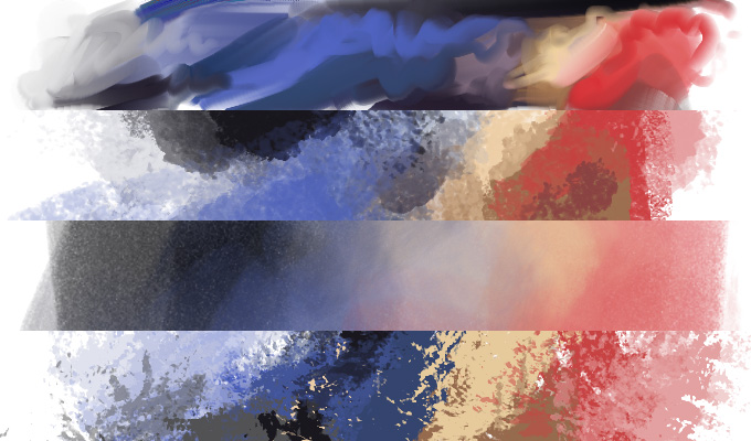
The 1. Oils Round Flex Wet is great for blending with a strong impression of brush strokes. It’s even pretty decent for just laying out swathes of colour, and has that fun slop-paint-everywhere quality to it.
The next two brushes are good alternatives to the airbrush because they do a similar job, but with texture.
The 2. Fat Fun Spongy gives a nice grain without being too sharp or noisy while the 3. Big Wide Softy is an even more subtle version of the same, with just a touch of noise to keep things interesting- this is definitely a “fill in the sky” or “atmospheric shading” sort of brush that should be used instead of that simple airbrush.
Last, we’ve got 4. Rough Dry Fun Big. This is the most punk rock of the brushes. It doesn’t care what you think; it’s edgy, high-contrast, and in-your-face. Absolutely wonderful for roughing things up, and, like all of the brushes here, can be used at a lower opacity to rough things up a little more lightly.
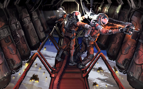
Now that I’ve told you about it, I bet you can see where I used the Rough Dry Fun Big in the above illustration in a couple different places. And look again at the images I opened the post with, you should be able to identify most of these tools in play.
How about one more thought on composition and artistic interpretation?
Here’s a game asset for a thingy you will be able to find around certain star(s):
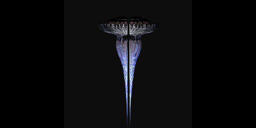
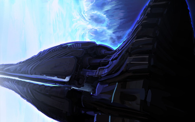
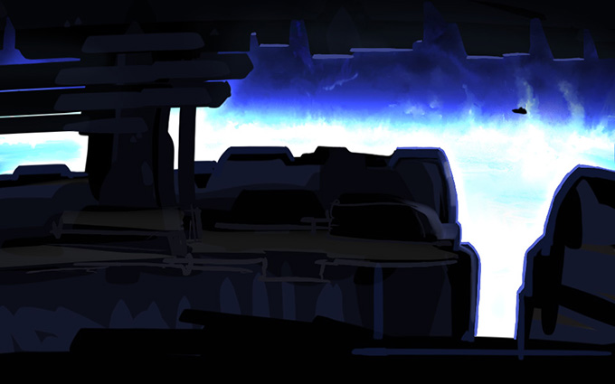
Great! A totally normal thing of little importance, probably. When you interact with it, how’s it going to look? I drew up two rough options, and by using what you’ve learned in this blog post you have to guess which composition we’re going to use for the final illustration.
Option 1
Options 2
Do you have an answer? I’ll wait.
.
.
.
.
.
.
.
.
It’s 2. Why? Because it’s showing you something you haven’t already seen!
Thanks for reading.
Comment thread here.
Tags: Definitely Not Problem Creating Solutions, digital painting, illustration, Perfectly Safe, photoshop, texture, totally ordinary things of little importance
