Revisiting the Intel UI
How the player finds out about what’s going on in the Sector – and specifically, what opportunities there are for them to take advantage of – is really important. Some examples of this kind of information, or “intel”, are a bounty posted by a faction, a mission to analyze a probe on the outskirts of the Sector, ongoing hostilities between major factions, the player’s recent discoveries, and so on.
The current UI for that is … well, I think it’s adequate, but its initial design was based one some assumptions and guesses about what the future might hold, and it’s showing more than a few rough edges. Rather than get into what’s wrong with it, though, I’d like to instead talk about the new information management UI design – which emerged after quite a few lengthy email exchanges with David – and what drove the decisions behind it.
As an aside, it’s often tempting to rewrite something because of course, it’ll be better the second time around! This can be a trap – time away from a piece of code tends to make one forget the nuances and difficulties that shaped the original solution and explain its lovable peculiarities. In this case, taking the time to really plan out the design ahead of time, instead of jumping right in, helped make sure it’s the right call to go ahead with it.
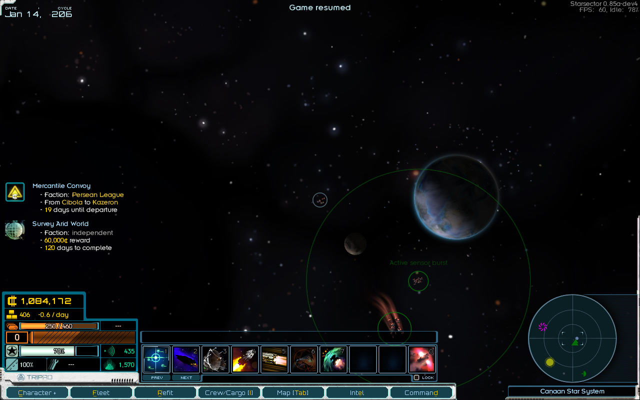
For reference, here’s a screenshot of the original design:

Now, back to the new design! I’d like for it to be simple and straightforward to use, let the player quickly sort through large amounts of information, make it easy to visualize the spatial relationships between events, and support pretty much arbitrary ways to display event or mission-specific data.
Oh, and it should also let the player do things like accept or abandon missions straight from the intel UI, instead of having to visit a planet-based mission board. While some missions should only be offered by mysterious personages in smoky bars, for the more general “procure this” or “analyze that” type missions that’s more an unnecessary hassle.
That’s not too much to ask, is it?
Tags
To be able to manage a large amount of intel, we’re going to use a tag-based system. Each piece of intel has tags associated with it – a bounty would have the “bounty” tag and a tag for the faction that posted it. It might also have a “new” tag if the player just found out about it, and an “important” tag if the player marked it important.

The player can select multiple tags, which lets them see intel that matches all of the selected tags. For example, selecting the “Missions” and “Hegemony” tags would show missions posted by the Hegemony. Selecting just “Hegemony” would show bounties, missions, and so on to do with the Hegemony – a good way to see what the various ways to get good standing with a faction.
Intel List & Map
Items matching the selected tags are shown in a list on the left side of the screen. Each item has some vital information shown directly in the list, for a quick overview (such as, say, mission duration and bounty reward amounts); what it is specifically depends on the item in question. The height of each list item can be different, so the information displayed isn’t forced to fit the exact same format.
The map also shows icons for items matching the selected tags. Clicking on a piece of intel in the list selects it and centers the map on its location, while clicking on an icon on the map selects the same item in the list. The “show on map” button opens the main map on the item’s location; this is handy for seeing its in-system location (if it’s known!) and setting a course.
You may have noticed that the icons on the map are round; this isn’t just me trying to be fancy for no good reason. Initially the icons were square, but it was feeling really messy. I tried round icons almost on a whim – because for historical reasons, the click-area for the icon was circular anyway – and they felt much cleaner. I think it’s because square icons have horizontal and vertical lines that just naturally imply that things should be aligned, and it looks messy when that doesn’t happen. Circular icons don’t create this expectation and so feel much better!
Intel Detail
When the player selects a piece of intel, detailed information about it is shown to the right of the map. This is also where the player can interact with it. For example, missions have “Accept” and “Abandon” buttons here. The specific format and presentation is again completely dependent on the intel in question.
It’s also possible for the detail UI element to take over the entire space to the right of the list, including the map. This is particularly useful for important Sector-wide events that don’t have a specific location, which would make showing the map unnecessary when looking at their detail. An example of that would be something like “Sector Decay” – keeping track of how things are going in the Sector overall, and when they’re about to go from bad to worse. But, that’s somewhat hypothetical now, so, a topic for another day – let’s just say there are some plans to take advantage of this functionality.
Impact
You might be wondering – why do this revamp now, if the existing UI is adequate? The main reason for doing it is not directly player-facing.
The way the existing UI was set up also forced a certain structure on a lot of the game’s content, such as missions, bounties, and so on. This means that adding more content increases the effort to revamp the intel UI later, because it requires re-implementing all the content using it as well; when that gets bad enough to no longer be an option, it’s known as being “content-locked”.
At this point, the game’s main features are are getting settled to the point where I’d really like to be adding more content of various types that connects up to the intel screen, and not being able to do it was becoming a roadblock.
Here are a couple of examples that either weren’t possible or were just awkward/inadvisable to implement using the old system.
Trade Fleet Departures
The player gets advance notice about trade fleets and smugglers preparing to make their way from one colony to another. (Naturally, this information is to be used responsibly, and not at all meant to encourage piracy, let alone make such objectionable behavior into a viable playstyle.)

Warning Beacons
During their travels through the Sector, the player finds warning beacons in hyperspace. Now, each such find results in a piece of intel for its location, making it easy to see exactly where these systems are located, and to perhaps note any pattern to their placement that might guide future exploration. (Naturally, so the dangerous systems can be more easily avoided, and not at all plundered for the riches within.)
![]()
Faction Commissions
This one was fairly doable using the existing system, but was more in the “I don’t want to do it just to have to re-do it” category. And, the new system does let me do a better job with it.
In the current release, faction commissions could be accepted from a mission board, and there was no way to resign one, short of ruining one’s standing with the faction. The benefit was a small bounty on the faction’s enemies, and a reputation bonus.
Now, it’s the same general idea, but:
- Taking on a commission requires talking to a high-ranking faction official
- There’s still bounty/reputation bonus
- There’s also a monthly stipend
- The player can resign a commission, either in person or through the intel UI

So: not drastically different, but smoother all-around. What will, I think, be drastically improved is the overall player experience in trying to digest the available information and analyze their options.
Comment thread here.
Tags: commissions, intel, missions, Sector Decay, tags, UI, unreasonably excited about round icons