Let Me Draw You A Starsector Ship, Part 2
Now where were we? Oh, yes, Drawing A Starsector Ship Part 2 (read part 1 here).
I believe I was fretting about the back of the ship, those engine pods and such. Let’s do another sketch:
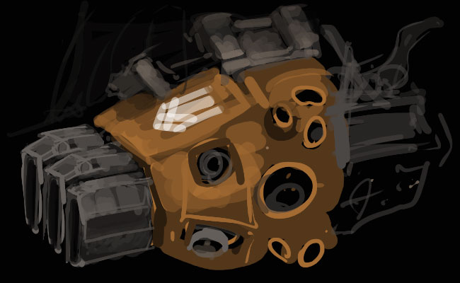
Hmm. While drawing this, I kept thinking “I’d rather be doing this experimentation on the sprite itself”. That, and I rather like the idea of echelons of squarish angle-corned thrusters for the primary drive with “barnacled” pods for the maneuvering jets. Well, let’s go back to the sprite and give these engines an overhaul, shall we?
(Also considering a comment from the forum thread noting that I’ve concerned myself a lot with asymmetry at the front of the sprite but little with asymmetry at the back. Interesting. Though I don’t especially want to have asymmetric engine pods for obvious reasons unless the mass of the ship was wildly skewed to one side. Which might be neat, but … this is not the time for something as off-the-wall as a B-Wing.)
— To the pixels! Jumped in with doing some pixel-brush painting, blocking out a base area with a 100% brush then doing detail and texture with 1-2 pixel radius brush set to very low opacity, sampling bits of colour from around the sprite as needed.

(You can see that I’ve got WordPress open on the left-hand screen, and my desktop a flat gray behind. I go for minimalist workspaces — there shouldn’t be anything on my desktop, both virtual and real, because I’m working, right? The subject at hand is the focus of my attention; anything else is distraction. Especially cats.)
I should explain a bit more of my work setup. I have my left hand on the keyboard to do shift/alt/ctrl as required to use secondary tools as well as hit the number keys to control opacity (as is Photoshop’s default). 1 = 10%, 2 = 20%, etc on til 0 which is 100%. Wacom is in my lap, pen in my right hand. I don’t abide by any of the bells and whistles Wacom sticks on its pads and pens; I find they’re distracting unless they actually contribute to what I’m doing and they haven’t yet. They just get pressed when a cat walks on the tablet and activates touch. (Thanks cat.) I used to use the ‘eraser’ side of the pen when I was transitioning from physical painting to digital painting but found that the act of flipping the pen over took more time/effort than just hitting the eraser tool. Use my hands, what, like the dark ages? Back to drawing!
Now rendering out the engine pod in the back. Here’s a thought- got a piece of hull that’s awkward to convey with what few pixels you have? Let the computer do the work by using the polygonal lasso tool to select the area, then shade the light & shadow using whatever airbrush you want. I mean, that’s how you use an airbrushes in real life, right?
This would make more sense if you could see the outline of my airbrush too hovering over the marquee.
I’m getting a little happier with the clustering of thrusters on the back but still want to give the engines some more oomph. I had some gray-metal extensions coming out the back of ’em which I accidentally deleted, and it turns out I liked how it looked better after that deletion so went with the truncated version. Then, for the back of the ship, let me pull a chunk of plating off a non-yet-implemented ship sprite I was doodling about with- this’ll make a good style base for the yellow armour layer. It’s a much more restrained style, less greebles, more subtle texture and colour. Below I’ve put the piece on the sprite and have a marquee up for doing more airbrush shading. I’ll colour correct it and start filling in everything else around…
Still, back to those engines, I’d like to get some big old-school Saturn-V style nozzles back there to convey that this is an old, functional design. Yes, really changing my mind here yet again. Organic process and all, right? And then that moment when you realize that your mirror-symmetry engines are off by a couple pixels:
Whoops.
Easy fix though, no problem. Ish. Except the problem is a few layers down and I’ve been drawing everything misaligned for like half an hour. Anyway, I’m feeling much nicer about those engines and I quite like the little highlight of amber-orange where the nozzles enter the drive casings. (That’s from just a dash of colour dodge used in a controlled manner there.)
(Side rant: contrast, dodge, and burn are cheap ways to get something to look ‘cool’. Take an ordinary picture, pump the contrast, suddenly it looks all dramatic and stylish. Pump the sharpness: even better! Right? No! Not everything should look equally dramatic and stylish and sharp because if everything is all that then nothing is and all you’ve got is a big noisy mess. Contrast and such visual drama should be used within a composition to intentionally signal whatever the piece of art is about. In Starsector, say, it is important that ships not be rendered with lots of full-bright full-saturation colours — or, at the opposite extreme, 100% 0,0,0 black — because then the weapon and damage effects will look bad and the player will have no way to know what is important because the ship’s hull looks like it’s made of laser or something. Um. In conclusion, don’t do that. Well, you can, but ideally use these as tools in a suite of techniques that all work to creating the image you’re trying to produce. If that’s avant-garde meta-commentary upon breaking the traditional qualities of art-making itself, then … well, that’s actually kinda awesome, just be sure to know what you’re doing.)
… Back to the spaceship! Let’s fix that misalignment and resolve the back end of this thing. And while we’re at it, pull the maneuvering clusters from the back and stick ’em on the front. Here:
The green square was for alignment. (And there’s a secret unused extra-greebly version of the Cerberus down there, too.)
Almost there. This thing is a *little* noisy, especially in the upper left gun mount (which should move forward a couple pixels anyway), and that bridge looks lumpy and misaligned. It wants to be asymmetric, but right now it looks like it’s slumped to one side because of an installation error. Let’s fix all of this. Kill the greebles by lowering the contrast (yes! lowering contrast!) with a light brush over the dark bits and maybe giving the whole section a little more of a rounded rendering. The bridge maybe gets some extra armour plating on the left side because that illegal hull mount just leaks radiation everywhere. The front could use some more blinging out with doodads, frames, and antennae as well.
Oh, jeez. You know what I forgot? To flip the image around. See here:
![]()
These ships need to “work” from all angles. And due to my handedness as well as eyes being dumb, I find that I draw things skewed ever so slightly without really thinking about it. It’s not a huge problem with sprites as controlled as these, but I definitely see it when doing digital painting. How do you see these errors you aren’t seeing? Flip or rotate the canvas! It’s all about changing your perspective, like having a 100% version of the sprite open on the other screen to see what the overall composition looks like while you’re buried knee-deep in pixels. In the image above for example the shading actually looked all weird around where the bridge meets the main bit of the hull, so I started fixing that up a bit. Also need to make those armour plates on the bridge not terrible and resolve the rest of the stuff that I just mentioned.
– Done. Now for the Horrible Background Test. Observe:
![]()
This ship is going to subject to all kinds of conditions — terrifying, deadly green radiation, scorching white heat, and the blackness of space. We need make sure there aren’t any holes in the hull that weren’t visible in more normal conditions. I’ll do some markup; it’s especially visible on green.

Ouch!
It’s a good thing we didn’t send this one out without doing this test first. Oh yeah, I changed the colour of that light in the back to blue to contrast with the hull colour. Not supremely happy with it, but a warm colour doesn’t work either with such a warm hull. Should try adding the internal lights to the other bays in the front as well while I patch up these holes (with a large pixel brush set to a dark grey, mode: behind).
![]()
Hmm. It’s a little noisy. But it’s okay. I’ll pull back a little bit on those glows. And heck, that back portion? Let’s stuff those unused Cerberus greebles in there; it’ll be like the hood of a hot-rod that’s open, implying some shoddy unofficial maintenance on the reactor core. And besides, this isn’t actually a real carrier. It doesn’t need to have a proper launch vs. landing bay. Now some curves adjustments, a bit of shading there, some burn here, a dodge there on the bridge to make it stand out, and here’s what it does as an animated gif:

I totally just did the contrast thing I was whinging about earlier, didn’t I. For a good cause I hope?
Phew. That took longer than usual – a lot more self-questioning and changing of direction with parts of the ship, probably due to having to write out my thought-process and feeling a little self-conscious about it.
But we’re not really done until we see this bad boy in action. I’m going to leave out the bit where I struggled to piece together the files required – I usually leave this step to Alex though have taken an adventurous dive or two into the ship editor to modify things in recent months. There are almost certain to be some additional visual adjustments required after seeing how this looks and feels in game. Often I’ll even add another turret or upgrade a weapon size or move something else around, as necessary. For now, I just base the hull stats off the “Dram” frigate-sized tanker and stick on the far-too-powerful PD drone system used by the “Astral” carrier. Now the test drive:

Yeah! (Wow, these drones pack a bit of a punch.)
Out of the box, the “Shepherd” (a working title) drone frigate feels a bit overpowered. Need to cut down the speed, the ordinance, the flux, and downgrade the power of the drones its carrying. On the other hand, taking out an Atlas isn’t a very impressive feat because it’s basically a flying bullet magnet. I ran another simulation versus a Lasher and got totally creamed, which felt about right. The PD drone damage output is impressive but they get swatted like flies by even a small machine gun burst. Which isn’t out of place, of course, these are tiny drones. Still, I feel like this would be more appropriate with some more heavily armoured and slightly less maneuverable lower-tech drones that couldn’t really be trusted to take down enemy missiles, but could perhaps (in a large swarm) overwhelm an enemy frigate. Ah, details.
But the ship is drawn! Are you not entertained! Balancing and getting the systems just right will take a bit more time and I’ll let Alex figure out if he wants to set up some low-tech mining drones to act as this guy’s little flock. In any event, I expect you’ll be able to play around with this ship in the next release.
To pull back a bit, Starsector’s ship art exists in a kinda weird place that I would argue is slightly too small for proper digital painting (and 3d renders aren’t my aesthetic), but also slightly too large for traditional pixel art spriting techniques, so it ends up as an odd mix of both. I admit that I rather enjoy working in this weird transition zone because it’s not something a lot of people are doing and it lets me do stuff that doesn’t have an obvious artistic answer which kinda defies easy categorization.
(So, ha-ha, Alex has to keep me around to do his art! Amirite? Right. We’re all good here. How are you?)
…
Want to read more on digital art technique in a rather more organized manner? Read everything by Arne Niklas Jansson. No, like, everything on that page. He explains how he applies artistic decisions to service game design and it’s really cool to see him work through that process; both coders and artists could learn a lot from him. Here’s his general digital painting tutorial and here’s the pixel art tutorial; very solid techniques all around. Go now, learn! Heck, even I re-read those pages every 6 months like a mantra.
Comment thread here.
Tags: frigate, photoshop, pixel art, ships, sketching, watch a sneaky modder rip the sprite from that gif in 3 2 1 ...