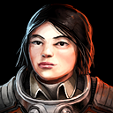
Portrait Hegemonization
Guide to the Wear and Appearance of Uniforms and Insignia
Revision Date pc205.03.20 // by Order of the Ministry of Naval Logistics
“Re-issue of uniform standards document has been ordered to all Hegemony personnel in the Naraka Strategic District due to statistically significant increase in lapse of uniform discipline incidents.”
“Officers are directed to review implementation procedures described herein and are reminded that any deviation from standard uniform to be authorized in written waiver only by commanding officer rank O-6 or superior.”
* * *
Players who have traveled the Sector have surely noticed that not every character of every faction is always in-uniform for that faction. This is mostly a matter of economy with game assets, as I really ought to only reasonably spend so much time drawing portraits versus other things that are more important to gameplay – like UI doodads and battlestation segments. Still, I’ve set an overall goal for myself (which Alex has not so much “directly approved”, more like “passively accepted”) to hit 100 portraits and call that “good enough for the game”. I’m not saying that’s the hard limit for all time or even not a number I didn’t simply make up because 100 sounded nice, it’s really just a shot in the dark at quantifying project scope even if that scope changes based on future decisions.
I’m at 85 portraits right now, not counting [REDACTED]. Or just 81 available to players, if you like that better. Almost there!
For some factions mixing in some off-brand portraits feels perfectly acceptable. For others, perhaps less so. The Hegemony, Sindrian Diktat, and maybe, mostly, the Persean League feel like they’d be pretty strict about uniform standards what with being militaristic organizations. So I’ve set myself the goal of filling out the Hegemony portrait set with entirely in-uniform characters while I’m otherwise padding out the portrait count and doing a polish pass over the whole lot for the upcoming patch.
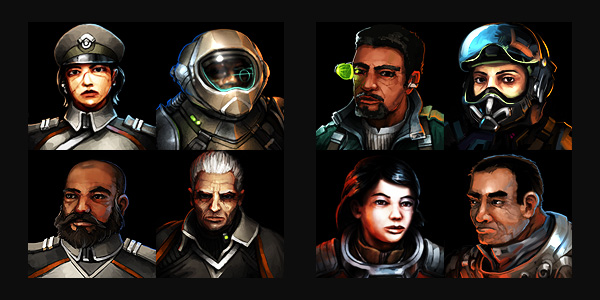
Let’s get to some examples. Here’s a familiar selection of characters from the Hegemony portrait roster:
On the left, we have characters done in the Hegemony style: gray/tan base uniform, white and orange secondary colour, and an overall militaristic aesthetic rather than spacepunk. On the right are a few non-Hegemony portraits that feel close enough to the style that they work in the set if you squint a little and ignore the standard-issue Hegemony Guide to the Wear and Appearance of Uniforms and Insignia.
Now it would be really cool to draw a ton of unique portraits for each faction, but that takes a lot of time for something that isn’t truly essential. What if we can achieve a similar effect without having to devote quite so much time to the task?
The Mr. Potato Head Approach
My thought is, what if we swap some parts on the portraits around to make new portraits? Stick some non-Hegemony heads on Hegemony uniforms. Could work. Or do a few quick modifications to a non-Hegemony uniform; change some colours and some minor details, and now you’ve got a Hegemony officer. This can be done without too much trouble!
Of course I’m a bit of a perfectionist, so I’m not going to leave it at anything quite that simple. I don’t really want to have Clone 1, the free trader, vs. Clone 2, the Hegemony officer, in the same context on screen (even if we do get portrait dupes in-game; just gotta accept that bit of contrivance). So perhaps we can take this Mr. Potato head approach and push it just a little further to make people look like distinct individuals while still getting some use from existing portraits as a base.
— We’ll return to this point, actually. First:
Facing Off With My Old Art
As mentioned, part of this effort involves doing a pass through ALL the portraits and cleaning up anything that stands out as odd to my (present) artistic sensibility. I’ve drawn these portraits over quite a period of time and my ability has absolutely changed (and improved, I should hope). Some of the portrait styles are just a little off from one another, and I’ll certainly accept a degree of that if I think the difference is artistically interesting.
As a wild tangent here, I’ll mention that I used to be way into Magic: The Gathering, and I don’t think it’ll come as a surprise that I was really into the card art. It’s quite noticeable that contemporary Magic cards have really strong art direction compared to 20+ years ago, but with that there’s rather less artistic diversity. I feel like they’ve lost a bit of the art, though they’re a stronger product. So it goes! Happily, Alex is willing to indulge my artistic sensibilities here, though of course will (very kindly) call me out if something seems off. I won’t tell the story here of how many times I’ve re-drawn the fleet intel icon.
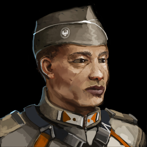
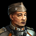
Let me explain a bit about my process here. When I first drew the portraits, I did them at-scale (128×128), and it was a bit rough to render important details such as eyes and hair at that size with broad painterly techniques. I could probably do a much better job now because I’ve improved my digital painting skills a great deal, but the way I dealt with this is I switched to drawing portraits at 512×512 in a fairly painterly and loose style then shrinking them to 128×128. I’ll do a bit of touch-up at 128×128 to smooth out rough pixels and adjust brightness to look good at small scale. For example:
You can see just how rough I worked at the large scale there, lots of blobs of colour, the Hegemony crest is literally pasted on the side of his hat, and the colours are a bit dull.
The final small-sized portrait gets itself copied, sharpened, then merged down on itself at 50% transparency to sharpen up the details. I’ll then clean up any lines that are too hard due to the sharpen pass – or fill out those lines that need to be harder if they got lost in the downscale. I’ll also really push the lights and darks to the point where it almost destroys the brushwork a bit for that blown-out cyberpunk aesthetic. I’ve taken to doing this by hand using a large airbrush tinted with colour set to colour dodge or burn so I can give a strong sense of unified lighting. If I ever really need to get the original work back to make changes, I’ve always got it saved in the big file.
(… I still might still zoom in a little closer on this guy’s face and adjust the eyes so that he’s looking more at the viewer. As a composition this is very right-focused with the figure looking that way and a strong light coming from that direction.)
About Face! (Back to Potatoes)
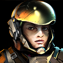
So I’ve overhauled a few generic portraits into Hegemony uniform portraits, here are a couple examples:
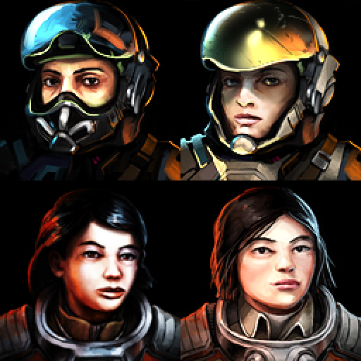
And now, to show how the trick is down, I’ll place them next to their base portraits:
(The lower left is among the older portraits in the game and was originally done at 128×128, upscaled to 512 and given some touch-up, then scaled back down. It’s been quite a journey! And even then, I’ll probably do a touch more polish because I feel like some of the linework and shading doesn’t hold up to my current standards.)
Anyway – here you can more clearly see how the new portraits are based on the old ones, though the reworking has been extensive. You may wonder, does this even save time if you’ve essentially re-drawn everything? Absolutely. A huge part of the work of creating a drawing is building up the structure and composition. When I recycle a base portrait like this, I can easily move form around a little bit, change hairstyle, face shape, skin tone, eye shape/colour, adjust lighting, swap out accessories, expand or contract various pieces. Every pixel can change, but it’s still using the previous composition as a foundation. It’s even possible to move and perhaps rotate larger forms around a bit! What you may notice though is that neither of the heads fundamentally changed their facing angle. Doing that would require a lot more work because I’d have to re-render all the features at the new angle, and getting the features to look natural is the true challenge of portraiture.
In terms of obscuring the reference portrait’s influence, mirroring the image is an obvious move to make side-by-side comparison difficult. And due to drawing base portraits at 512×512, I can actually crop the portraits a little differently if I so desire. I can leave more room at one or the other side, or zoom in slightly, or even zoom out slightly by scaling the base down and filling in a bit around the edges. Tricks like this mean you can’t just squint and know for sure that those two blobs are really similar in composition even if the pixels don’t quite match.
I’ve got a few more to fix up here, so I’ll get back to that.
Look sharp, spacer!
Comment thread here.
Tags: hegemony, Hegemony Guide to the Wear and Appearance of Uniforms and Insignia, painting, photoshop, portraits, sneaky artist secrets

