Cartography
The map UI in Starsector hasn’t changed much since it was first introduced, back when Corvus was the only star system and there was no hyperspace. It’s been tweaked here and there to support new features along the way – terrain, for example – but the core functionality has remained the same.
With the upcoming update drastically increasing the number of star systems the map has to handle, and its focus on exploration, it was finally time for an overhaul.
Procedural Generation
Getting into the low-level details of how the procedural generation works might spoil the experience of actually playing the game, but it’s probably alright to talk about how it works on the macro level. So, let’s go for a high-level overview, just to get an idea for what the map needs to work with.
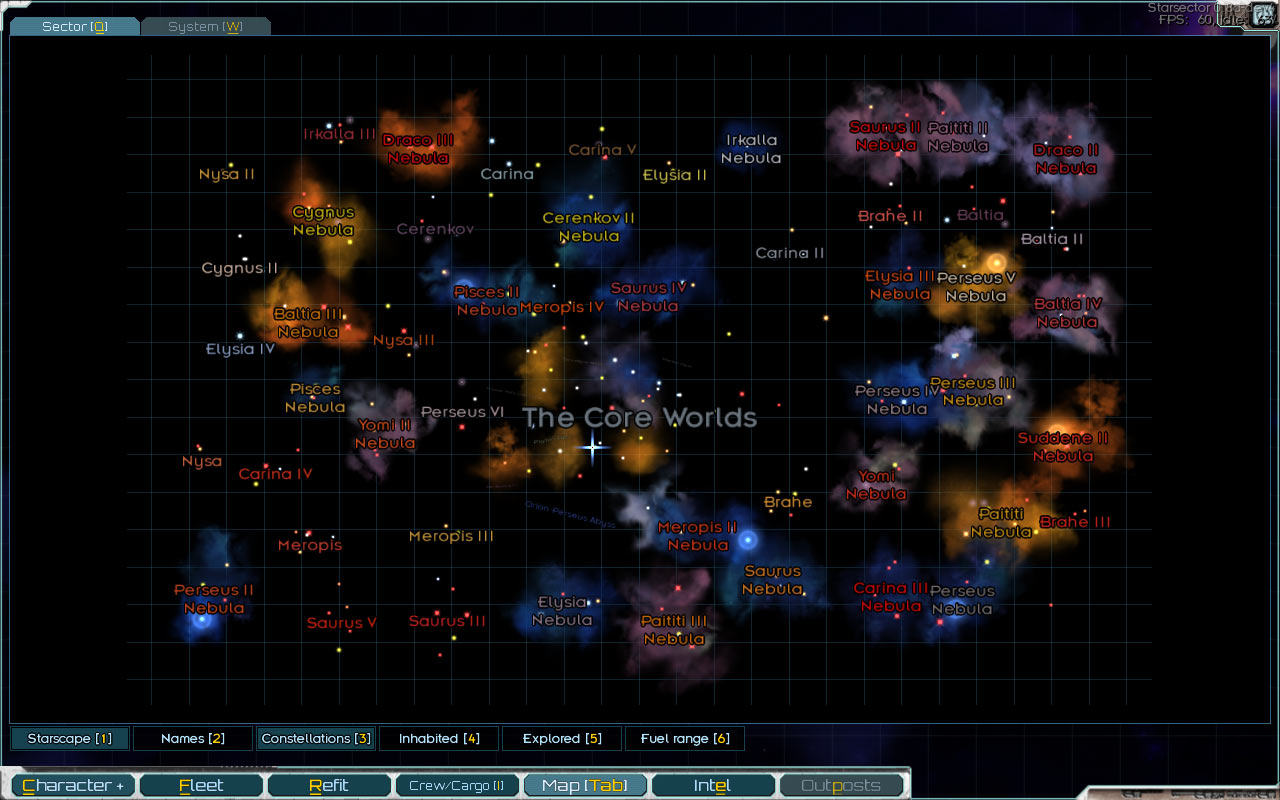
At the center of the Sector are the “core worlds” – a number of hand-crafted star systems that are mostly the same from game to game. There’s some variation, for example some systems are set to have their outskirts be procedurally generated while the populated worlds remain the same.
The procedural generation algorithm puts a bunch of constellations in the empty space that remains around these systems. Then it clears out and adjusts hyperspace around these to make it look reasonable – clear areas around stars, some passages between systems, etc. The details are more involved – for example, what sorts of things might show up in the 2nd orbit around a gas giant orbiting a brown dwarf in an old constellation? – but looking at it at this level, it’s fairly straightforward.
This approach is mod-friendly, since a mod can add whatever fixed star systems they need, and the procedural generation step will just fill in the empty space that’s left. Or, this step could be overridden entirely by a more radical mod.
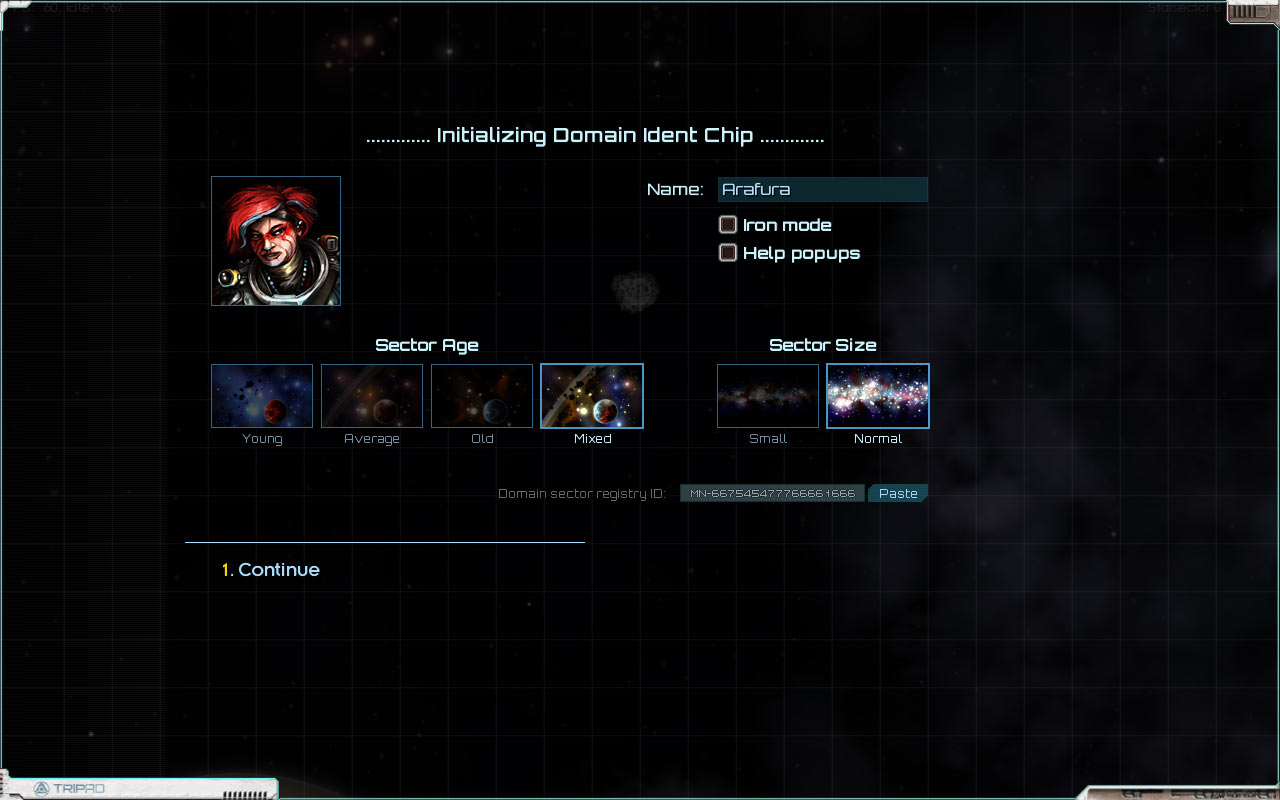
The entirety of the procedural generation is controlled by a random seed, or as it’s presented in the game, the “Domain sector registry ID”. This can be copied from the character screen in a game and pasted into the new game dialog to revisit the same Sector multiple times, or share a particularly interesting configuration with others.
Map Filter
One of the problems for the map overhaul to solve is the various ways the map might be used. Are you looking to get an overall sense of the Sector’s geography? Trying to keep track of what you’ve explored, and planning future exploration? Do you just want to see where the nearest port is?
It’s too much information for any single view to express adequately, so: a configurable filter to adjust the map for any given purpose. It allows you to turn planet, star, and constellation names on and off, show what’s been explored, and show the range of your fleet given its current fuel reserves.
Starscape Mode
The filter also allows you to switch the hyperspace map to “starscape” mode, which is a real-space view of the Sector, rather than the hyperspace view which the default map view shows.
It’s definitely a bit gratuitous; I’ve got a soft spot for starscapes. It’s also, as David has put it, something to “make the Sector feel more like a real place”. Hyperspace is not very relatable, and it’s nice to be able to step outside that and see the Sector as it “really” is.

However, there are also practical reasons to use this view. The colors of the nebulas indicate the ages of the constellations, which in turn affects what you’re likely to find there. The view is also less cluttered and easier to read when zoomed out, making it superior for getting an overall feel for the layout of the Sector.
Text Layout
Another issue with the original map is text overlap. Every entity’s name is to the right of said entity, and if nearby things-with-names (stars, planets, etc) line up horizontally, the names overlap, often making both unreadable. That wasn’t good at any point, but it was manageable with the small number of stars, and the fact that those stars were laid out manually. With procedurally-generated stars – and a lot of them – this makes for a complete mess.
However, laying text out perfectly so that there’s never any overlap is not an option. It’s not always possible for every configuration of nearby stars, it’s dependent on zoom level (more zoomed out means less space for names), and I’m fairly sure the general case reduces to one of those “hard” computer science problems to boot.
So, we give up on trying to make it perfect. The filter allows us to turn the names off if they’re in the way, and we can always zoom in to the point where overlap is extremely unlikely. Instead, the new approach will just try to do a good job most of the time.
The way it works is for each entity, it looks at other entities within a certain area nearby – a rectangle, wider than it is tall, since names are long horizontally, and there’s no potential for name overlap with anything that’s even a slight ways above or below the current entity.
Given this set of nearby entities, the current entity decides whether to display its name above, below, to the left, or to the right. If one direction is clear, it’ll pick that. If every direction looks potentially troublesome, it’ll look at the relative positions of the two nearest entities, and make its decision based on that.
Importantly, each decision is made in isolation. The algorithm is not trying to find the optimal name layout for a set of entities, but making a choice for each entity without knowing what choices nearby entities will make; doing it this way keeps the algorithm much simpler and computationally light. (Looking at it now, there’s some similarity to how the flocking algorithm works, though I didn’t start with that in mind.)
Although the decisions are made in isolation, they’re also made in such a way as to minimize potential conflicts. For example, if an entity’s nearest neighbor is to the right, it will prefer to put its name below, while its neighbor (provided they’re mutually nearest) will prefer to put its name above. Think of it as everyone (well, almost) driving on the correct side of the road without having to check with other drivers all the time.

As you can see, it can handle some tricky-looking configurations, though it’s certainly not perfect.
Other Improvements
There are a number smaller quality-of-life improvements, too. A quick rundown:
- You can switch to the hyperspace view while in-system
- Zooming in centers on the mouse cursor rather than the map center
- The maximum zoom level is set to make sure the full map fits on the screen
- Double-clicking the “sector” and “system” tabs (or double-tapping the shortcut) zooms out and re-centers instantly
- Holding shift while zooming zooms faster (more important since the zoom level can be quite high)
There’s also direct integration with the “Planets” section of the intel tab, which you can see in some of the screenshots here. This actually gets a bit tricky, as the player clicking on a star (or another entity) might mean them wanting to do a number of things.
They could just want to lay a course to it, making their fleet travel in that direction. They could want to open the map for that system, which they can do if they’ve already explored it. They could also want to view detailed system and planet information in the intel tab. How do we make all this happen without bogging the interaction down?
An obvious answer is a menu – click on star/planet, see menu, select option. A basic menu like this is two clicks – acceptable, but we can do better.
Instead: a menu that shows up when you press the mouse button down, and that selects the option under the cursor when you release the button. The first option is always positioned to be at the mouse pointer, so selecting it is a normal click rather than a more-cumbersome menu selection. The player is also made aware of the menu, since it’ll show for a bit while they’re holding down the mouse button.

Overall, I’m happy with how the map feels now – using it is natural, and pretty much all of the pain points from the previous version are gone. The functionality is also easy to extend, so if for example more filter options are needed as the campaign gameplay opens up, it’s in a good place to allow that.
Taking advantage of this flexibility, I was able to replace the starmap in the intel-system-view tab with this one. This is nice because there’s more consistency in the various maps used across the UI, and the new features from this overhaul make the map much easier to use in this context as well – e.g. moving around the view and clicking on stars to open up detailed info, without having to switch to the map tab proper.

Sustained Burn
Speaking of quality of life improvements, this is a good place to mention it: the Sector is getting pretty big, and travel can take a long time. To help keep things from getting too bogged down, there’s a new toggle ability – “Sustained Burn”. It does the following:
- Increases maximum burn by 10 (!)
- Reduces sensor range by 25%
- Increases detected-at range by 25%
In addition, activating it gradually but quickly stops the fleet, and then it slowly picks up speed until it reaches the maximum. Acceleration is much reduced, so turning is slow. There is no supply or fuel cost to using the ability, since that would make slower and more boring travel cheaper, encouraging the player to do that, which is the opposite of what we want.
Tactically, the goal is to have something you can use when you feel reasonably safe, while making sure that it’s not a “get out of combat free” card. That’s not to say it’s completely useless in a dangerous situation – it can be great for getting away from an enemy once you’ve opened up a bit of distance, or for coming in hot and then switching to emergency burn for the final pre-engagement maneuvers. It can lead to some tense moments as it’s powering up slowly while an enemy fleet is closing it. It’s just not a button you can press to always get away.
Comment thread here.
Tags: filter, intel, map, menu, procedural generation, starscape, sustained burn, UI