typically you want to stay away from red when designing for color blind
here is a pic of what the USA flag may look like depending on how color blind you are

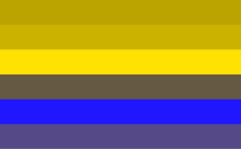
please also take note that if one is red color blind then the actual color RED will likely appear to be GREEN to the viewer. (i have a color blind friend and also the pic shows that) that is in turn also why most color blind UI's should not incorporate the color red next to a color green. Also the other common color blindness is blue and yellow. where blue looks green and yellow looks red.
it should also be said that most people who are actually color blind are Red Green color blind. most primates and mammals can not see red at all or if they can its faint due to them not evolving the ability to see it.

A rainbow of colors as viewed by a person with no color vision deficiencies.

The same rainbow as viewed by a person with protanopia.
The same rainbow as viewed by a person with deuteranopia.

The same rainbow as viewed by a person with tritanopia.
aside from that im looking forward for the next release.


