Haha, at first glance, the art would be fine. Although the quality of other mods in general has gone way up and it was starting to eat at me.
Now, while the new "art" won't be as good as a lot of the mods you see now either, one of the things I want to fix some of the obvious "vanilla ship plastered on top of vanilla ship" instances that you tend to see with virtually every original Scrapper ship, for example:
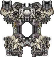
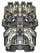
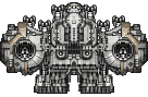
The beast here. You can see the three different ships it's comprised of, and I do little to nothing to alter anything about it.
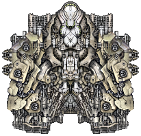
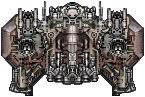
It looks okay, particularly in game, but it doesn't really cut if for me. I wanted to take a little more time and make it unique, so I remade the beast into this:
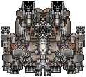
It's taken from a lot more pieces, ideally you shouldn't be able to easily pinpoint any two or three ships it's eaten from. And it looks nice 'n scrappy. Besides, that also brings us to another problem a few ships have. That some of them are
too similar, in the case of the beast with the Menace, which was
nixed along with the Bite which is too similar to the Vice.
There are more problems though, such as
sizing.
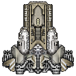
This is the Refuge, a Frigate. I've heard some people tell me it needs to be a destroyer. It'd be a small destroyer like this though, and it still has some of the lazy design mentioned earlier. It's a mirrored piece of freighter strapped to a Brawler.
So it now looks like this:
It's larger, asymmetrical, and has more weapons options fit for a Destroyer. But I
liked having a frigate carrier, I really did. With built-ins, having one that is worse at actually being a carrier with 1 flight deck should be possible, which is why I added a new ship to replace the Frigate version of the Refuge.
Meet the Wingman.

Very similar to the old Refuge, although will be much more fragile, and fighters would, in my mind, take twice as long to repair from it's dock. Graphically, much nicer than the old Refuge that's for sure.
While on the topic of Sizing, the Vice and Bite were way way too small for what they did. As I mentioned above, the Bite was nixed. But the Vice received an overhaul.

This is the new Vice. It's got only one Medium mount, but that's a balance thing. Two was stupid, it really was. It's still got a powerful front though, you can have a medium weapon next to a strong small one.
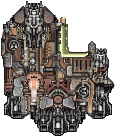
The list, of course, goes on and on. Some ships were removed, but a few were added in as well. I'd say it's pretty hard to believe that anyone was particularly attached to the ones that were nixed, perhaps the only dissapointment would be that as of right now, the Reaper is gone and has no replacement. I might bring it back, but Phase ships don't really fit well with the Scrappers. That being said, this little dinky fellow is still here, and it's not just a spliced off mid-line shuttle anymore.

Honestly, it looks super dumb. But it's suppose to, and it lost most of it's weapons because it was a little too good for what it was suppose to be: A ridiculously cheap Phase ship. This right here? This is bargain bin. That was my original intent.
On the topic of design, I always liked the idea behind the Striker. It was one of my favorite ships in fact, although at the end of the day, it was the bottom half of a vanilla ship with guns on it. Like seriously, look at it:
Let's make it meaner:
Ihe new art isn't perfect. Far from it, but at least the ships look more unique than they did originally, which in my opinion, is pretty important. Every ship that remains has gotten a new look. Now, I've also got this problem where I really can't focus enough to make really good larger ships. It takes a lot of effort, I don't know how people do it. I did my best for the last two though.
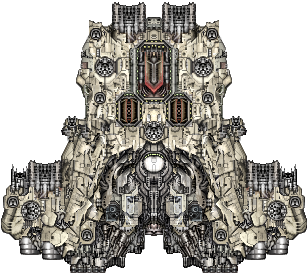
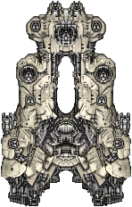
The Battleborn needed it's gun count reeled in. But it also needed to be more than just a Conquest slammed on top of another ship with an Eagle somewhere in the middle. I'll admit, it lost some of it's beefiness, but I'm happier with the new ship overall from a graphical and balance standpoint. Oh, and here's this guy. You know this guy.
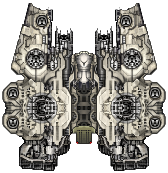
It's still 4 Onslaughts married together with a station, but I made it blend better :p. I also made it more of a "bio-dome" ish structure. Those mounts will also all be forced built-ins, and it will have some new mechanics.
In closing, whether you like the direction of the new art or not, I hope people at least understand why I'm changing it. There were a lot of things that were bothering me, and I feel it's important to bring it up to speed so it feels more worthwhile next to other mods. Super high quality art isn't the most important thing, but I think identity and uniqueness has a huge impact that the mod formerly lacked, just by being too much of a garbagey kitbash.
EDIT: Oh, and yeah my Avatar is still a Platypus. That is the new Platypus.